Key Art Design
Concept
Art Direction
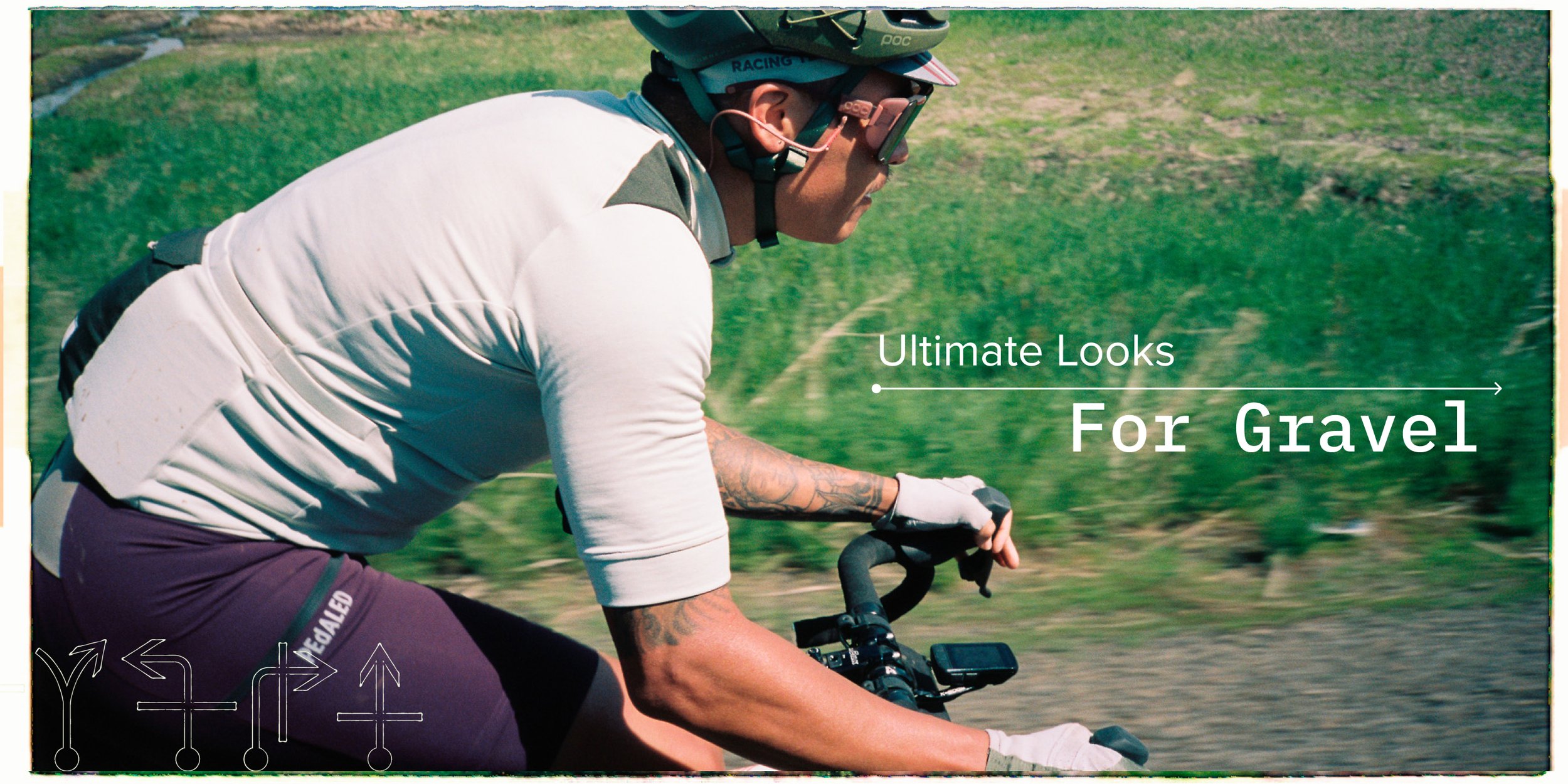
Campaign Design
Quality Assurance
Role
Creative Director: Taylor Buck & Inese Selina
Producer: Maeve Reiss & Chris Latimer
Photographer 1: Topher Delancy
Photographer 2: Jake Nelson
Copywriter: Max Polin
Visual Merchandising: Eric Pool
Crew
The Set Up
Fully admit I have a bias when it comes to bikes on any kind of dirt. More specifically, gravel riding. I come from the Midwest, Minnesota to be exact. This is where US gravel riding was born. Not because it was the cool-kid thing to do, it’s what we knew as racing in the Midwest. Rolling hills, long distances, farmland and forest roads. If you wanted to get away from people, get chased by farm dogs and ultimately destroy your legs gravel riding was the way to do it.
When I finally joined the bike industry in the late ‘00s I would talk with traditional road cyclists on the subject in Colorado, they didn’t get it then. By now, it’s mainstream. Most of those road purists I talked to back then are now riding drop bar bikes with big tires. I was hyped we were finally doing a real gravel guide for Competitive Cyclist.
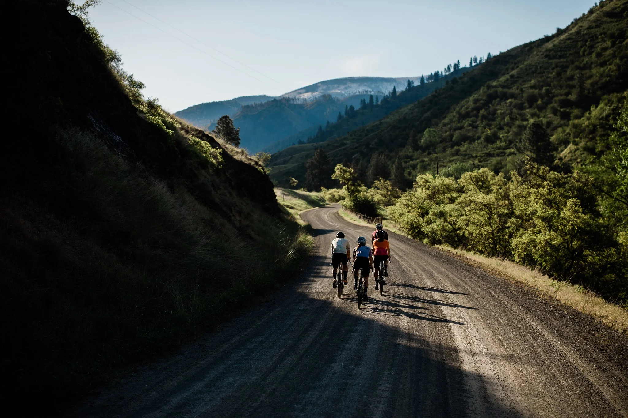
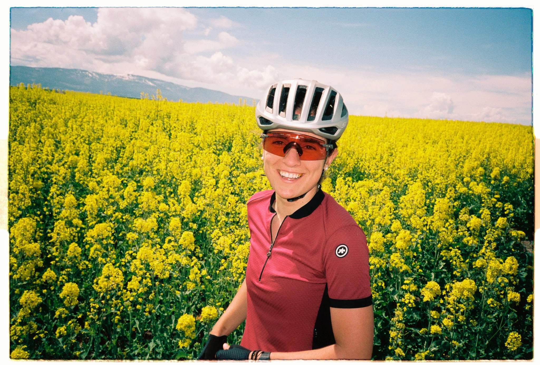
Our expertise was heavy in this one. We had a great crew to bring to the shoot and capture some content that would live longer than a season or two. We also wanted to show our relevance in this category. It wasn’t in the cards to take the shoot to Kansas or Iowa as we would have liked. We needed somewhere with endless gravel and diverse backdrops. I’ve spent a lot of time riding and fly fishing in the Salmon River area of Idaho. We could capture the forest roads, farmland and adventurous riding that is romanticized in gravel riding.
Our objective for 2023 was to capture both bike & apparel guide in these shoots. Additionally, we were setting up the redeveloped visual language for that year and where the brand was pivoting to reach a broader audience.
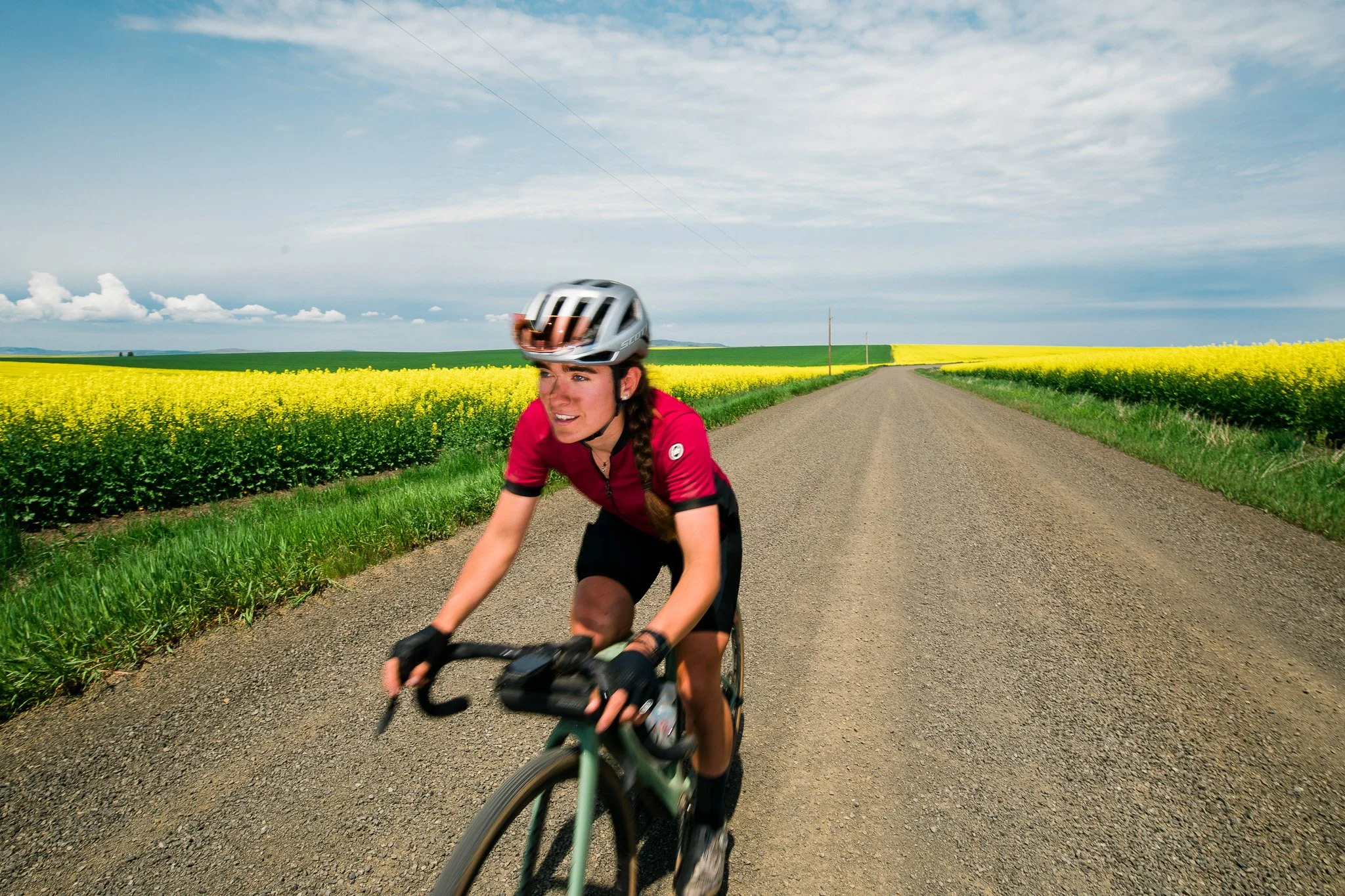
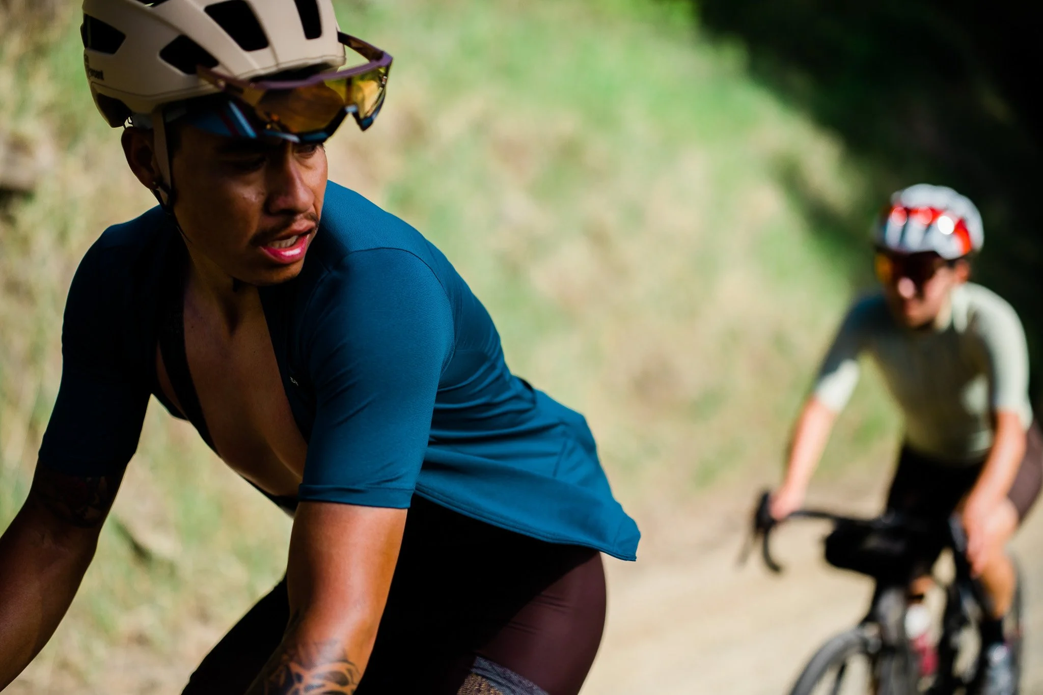
The Gravel Bike Guide and the Gravel Apparel Guide had different moods. The bike guide needed to be more technical and showcase what these bikes were capable of. We also wanted them dirty for the “beauty” shots. This way we proved our expertise through the photography. The apparel guide was to be more story telling and provide information about what the clothing was intended for. Our themes for apparel were race day, training and adventure (or party pace) for the everyday rider.
Overall hero for the CC ‘23 Gravel Bike Guide
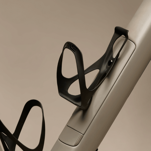
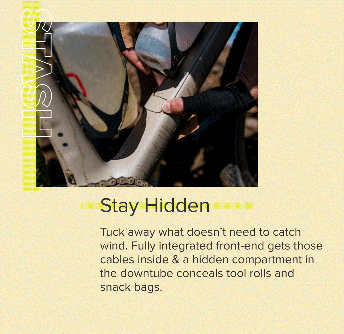
Studio shots of the Enve MOG panel detail
On location GIF of the same bike used for the Bike Guide, but with a relatable vibe
Apparel detail selections
Getting the Shot
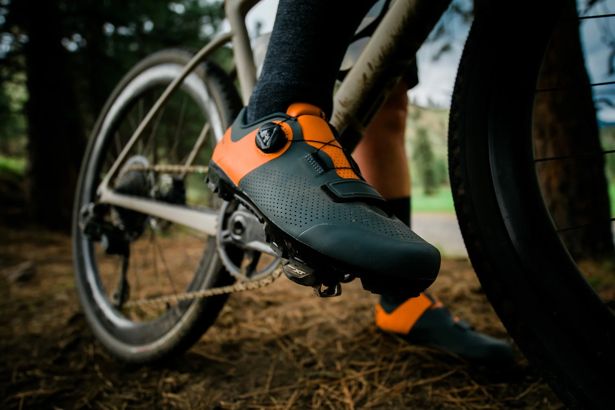
Often times we get too carried away with getting the “safe” shot and not telling the story about what the product was meant for. We want to show the product in all of it’s glory and make it visible, sure, but shooting in a more dynamic way get the attention. This may not always be the most glossy photo. For the footwear segment, just like anything else, we needed the product details, but there’s more interesting ways of capturing a shoe in action.
What was likely the favored shot was one that I did stage. We pulled up to a patch of gravel above a pit surrounded by lush pastures of green and yellow canola flowers. Everyone asked why we were at the top of this hill with partially dried mud patches and nothing really interesting around. I pulled our 7 gallon water tank out and created some mud for the riders to pull through. Said we were going to play in the mud and get some footwear shots. Our photographer was hyped to play with an off-camera mini flash that could capture some moments like these in a more interesting way. The result was the select from above.
The final selects were to all receive the same grain and treatment as the ones we captured on film. The result of the final below was the most beloved shot that later got emulated into our Mountain Bike Guide

A set of way finding icons inspired by the queue cards from early gravel racing were designed to embellish the experience of the Apparel Guide. These had a stamped and worn appearance

These made great email dividers and animated GIFs
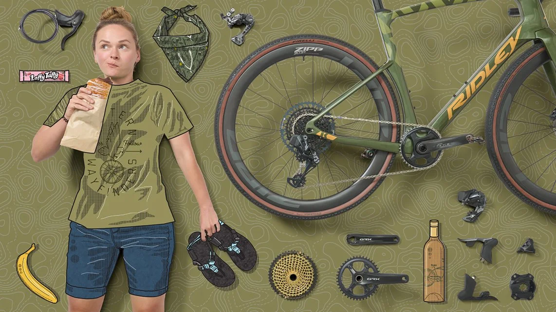
The prior guide was at a time that we didn’t have the ability to shoot on location or even bring a lot of product into the studio. Supply was very limited and we did something that we did for the Road Bike Buyers Guide. We brought in illustrator Bicycle Crumbs to help reimagine what the guide could look like for the person dreaming of gravel.
It was still something experimental, but had cultural relevance. We had a set of colors that we used for the different categories of cycling. “Champion Yellow” for road, “Moab Red” for MTB and “Olive Fab” for gravel. This gavel us some separation when it came to combining these categories in shoe guides ETC. We shot models and product flat-lays on paper seamless and filled some of the spaces with gravel-centric accessories or props. These illustrations later lead us to use them for our 12Days sale event.

Because we got so many great shots and b-roll at this shoot, much of this would live on to be added to sales and other large moments that we couldn’t shoot into