Key Art Design
Concept
Illustration
Art Direction
Campaign Design
Quality Assurance
Role
Creative Director: Taylor Buck
Producer: Chris Latimer
Photographer: Benjamin Khuns
Illustrator ‘22: Bicycle Crumbs
Illustrator ‘21: Ellen Schofield
Copywriter: Max Polin
Video Direction: Sunn Kim
Visual Merchandising: Eric Pool
Crew
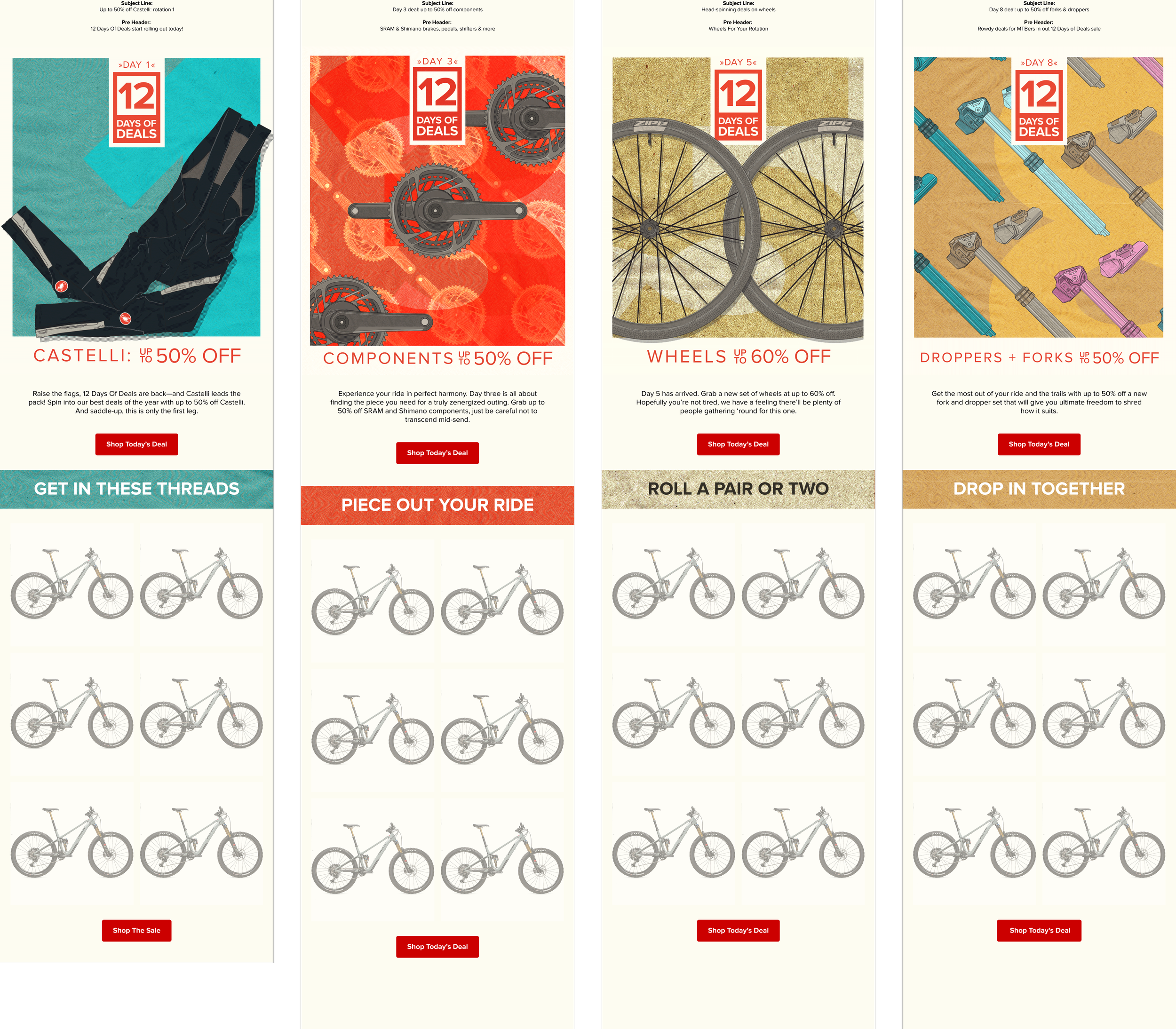
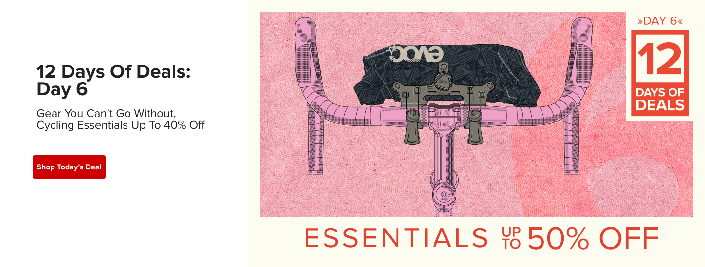
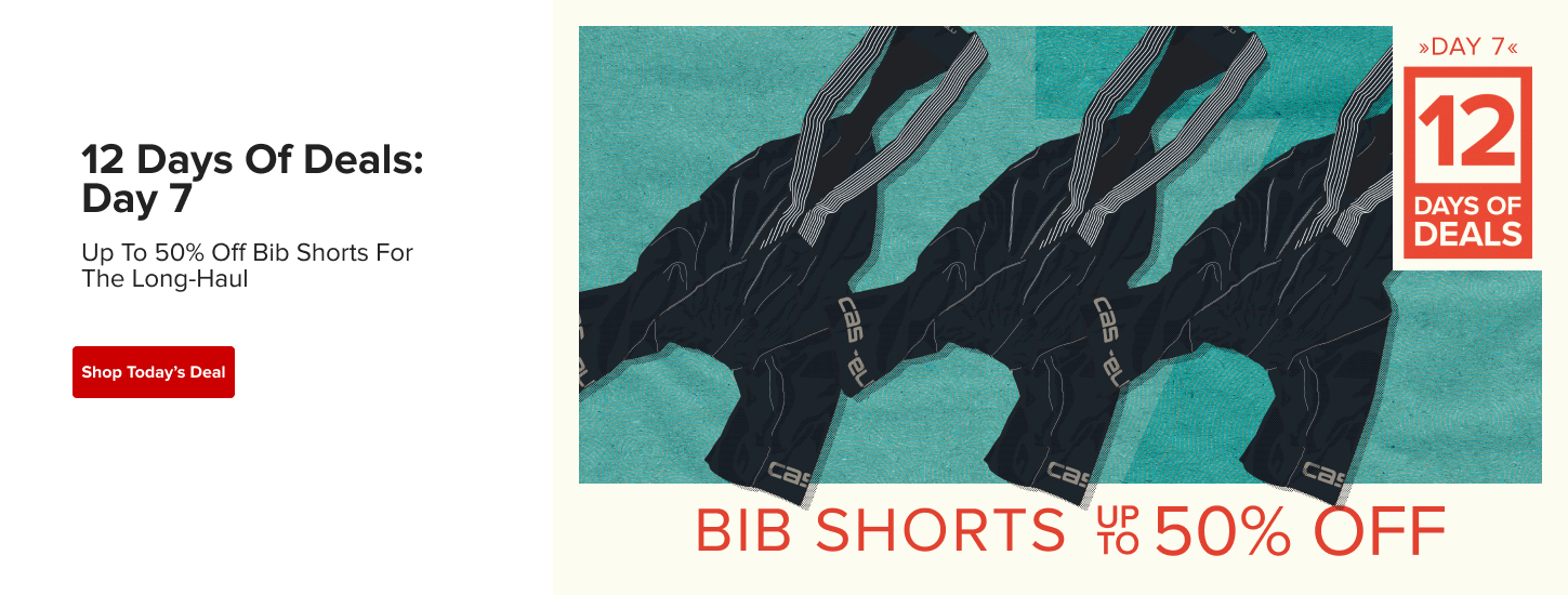
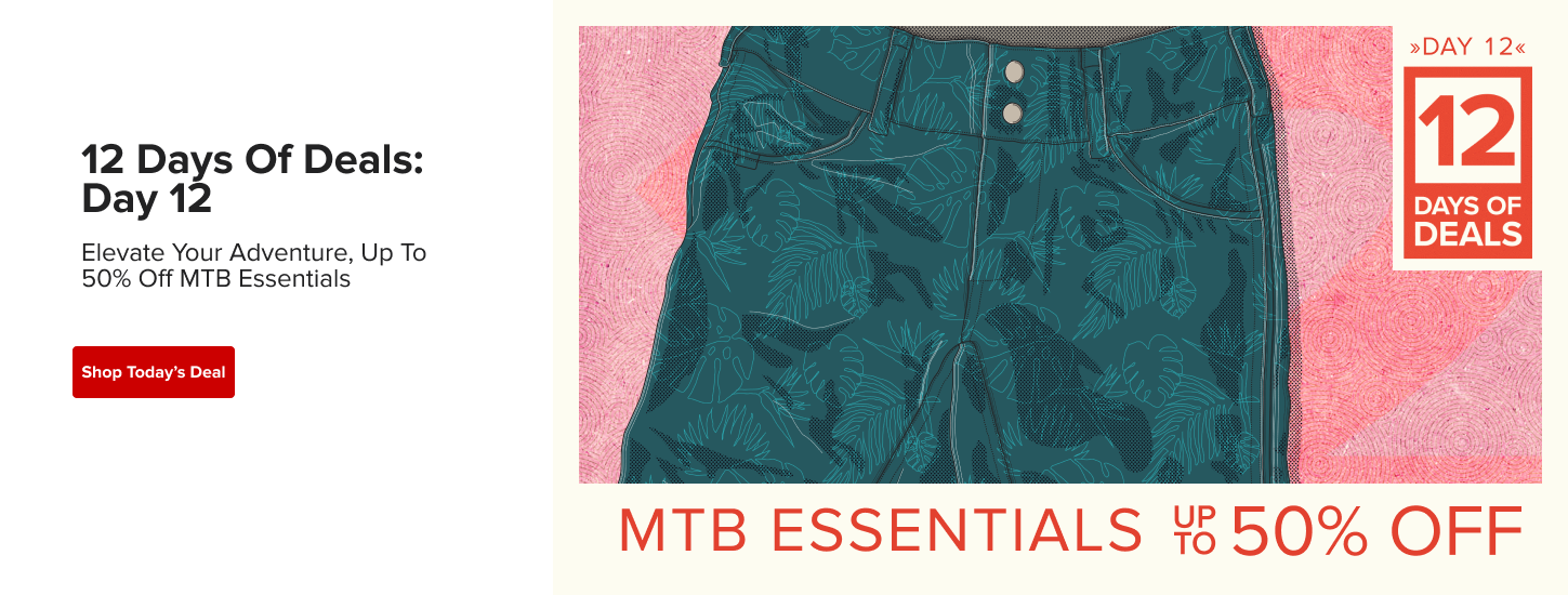
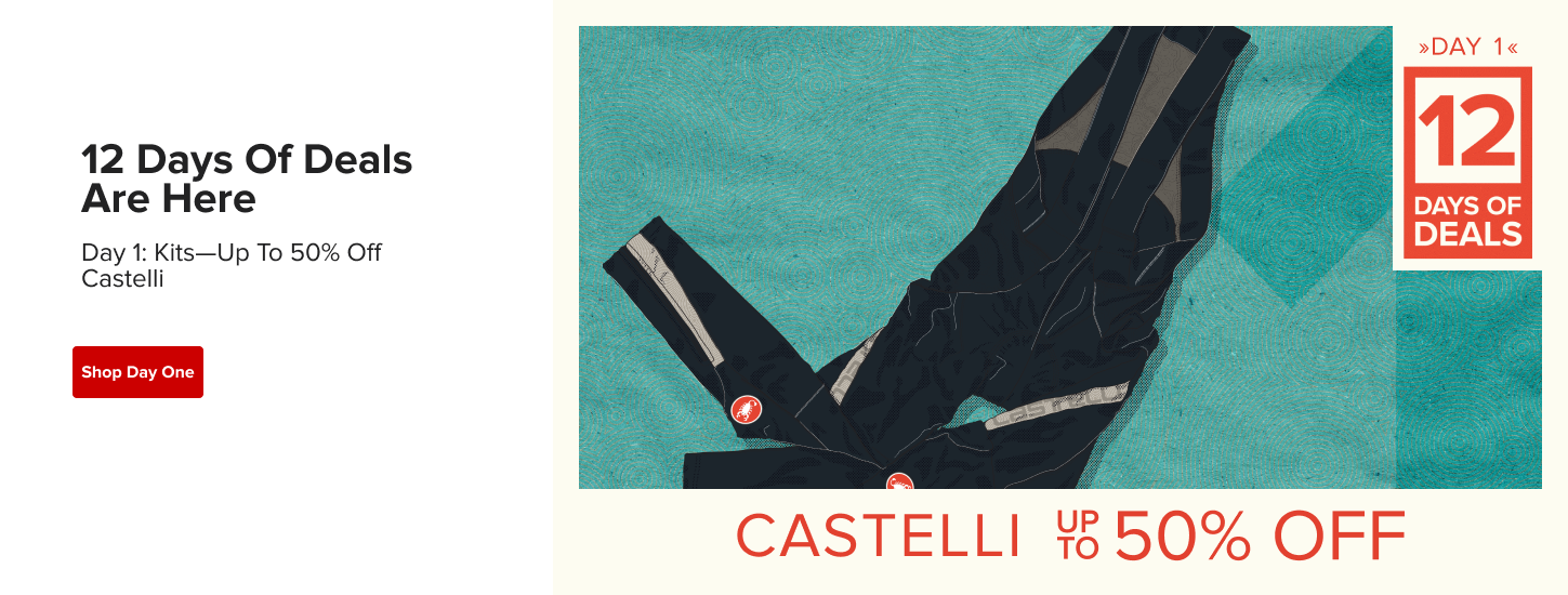
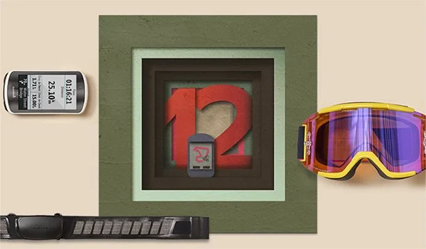
The bike industry has a love/hate relationship with sales. We never want to cheapen premium product, but customers love a deal. Every year, following Black Friday/Cyber Monday, many brands have their version of 12 Days of Deals. We Set ours up to have an ‘advent’ element of surprise. Admittedly, when I pitched this idea to my first Creative Director at Backcountry, he absolutely hated the concept I pitched, but loved the idea of adding an illustrated element to it. It was brave of me to take this on as not only the sole graphic designer on the project, but also as the illustrator.
The illustrations would serve as a representation of what each product on sale would be while adding some ambiguity to increase click rates.
Our Largest Brand Sale
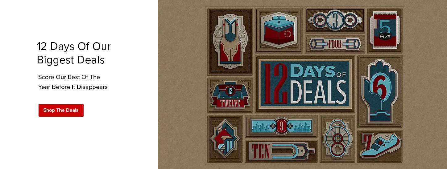
2021 12 Days Illustrations by Ellen Schofield
I was inspired by the art & cycling culture of the Art Crank movement in Minneapolis that later became a nationwide art show. Sadly, Charles Youel ended the ride a few years back, so we won’t be seeing the community poster shows anytime soon. I’m hoping this will be revived at some point. Tangent over.
Illustration has always been a big part of cycling culture. The first year in doing this, I wanted it to be more like the illustrations associated with the poster show but it wasn’t in the cards. Still, I wanted to push for something tactile, illustrative and that could juxtapose with the products we shot on seamless as a flat-lay. This is matching how we shot the previous year, but we shot in a way that left room for illustrations to show up or was easy for me to comp the image to fit our needs.
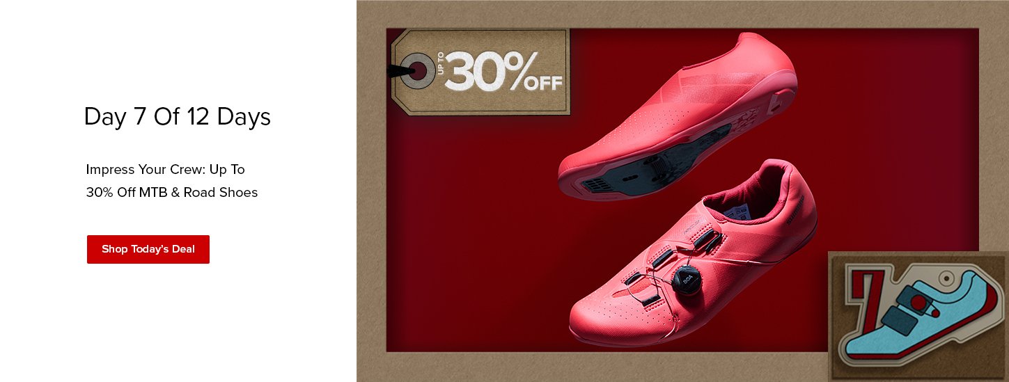
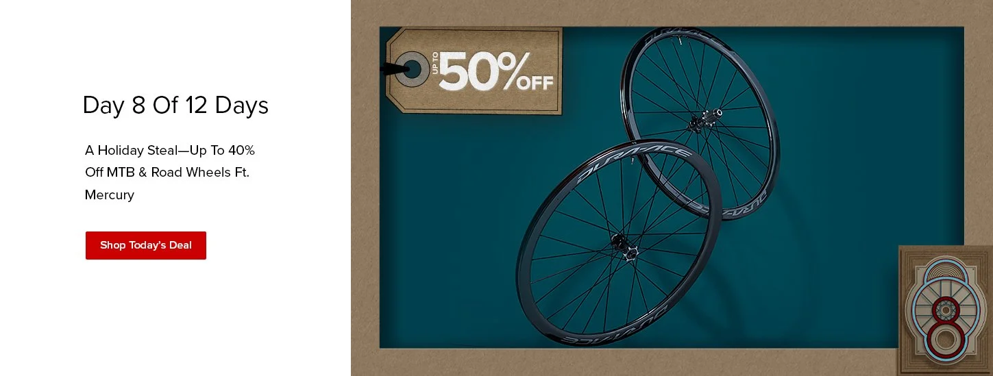
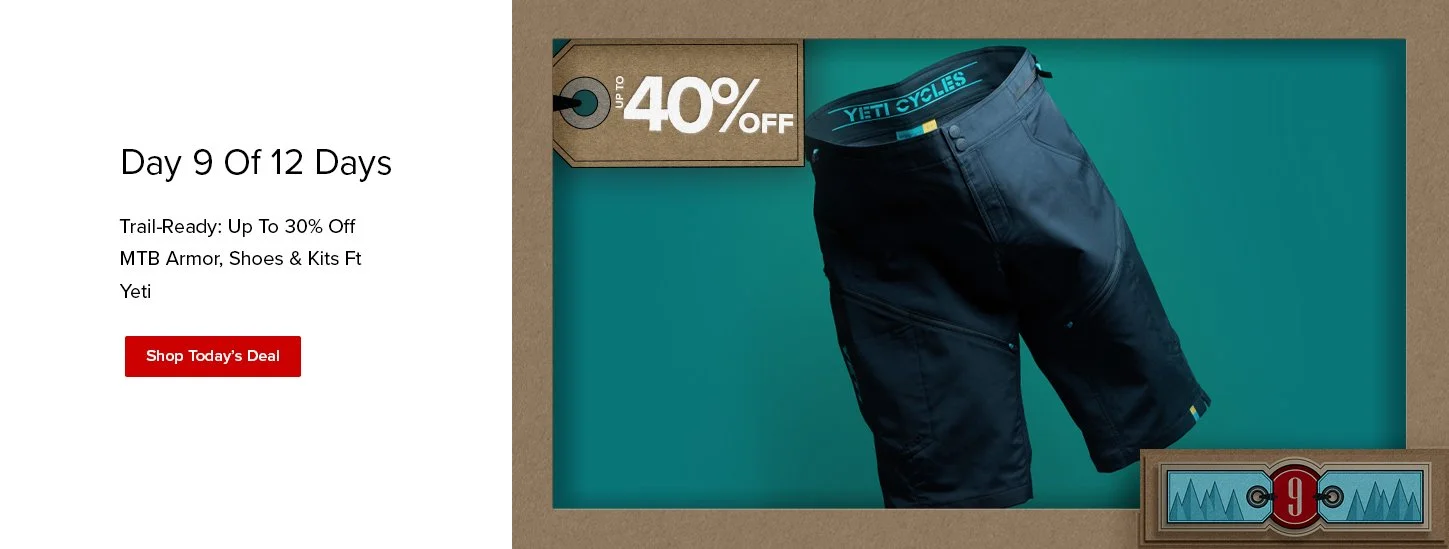
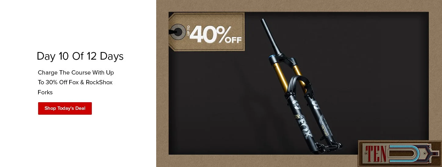
What I ended up with was making a set of vector illustrations that corresponded with the deal of that day. Additionally, I used our CC red and brand font of Proxima Nova to create the paper cutouts of the 12Days lockup & the numbers of the day. That way we didn’t stray too far from our brand’s elements. Daily, we would update the site hero on the home page on the day of that deal as well as the LP. We sent daily emails each morning with art that revealed the deal of the day. At this time, our emails were simply a headline » hero » body copy » product. Easy. The aspect ratio also matched the site hero banners which were also overly simple and not very editorial feeling.
Additionally, we didn’t have a lot of motion in our emails just yet, so all of this was new to the business. Everyone was excited with the illustrations, but by the final email they were more excited that I had added motion to the hero. This is when we began to trans form the CC look & feel. We still continued our tone in our voice but would simplify the message.
The mixed media approach captured the attention of the leadership and was something that they would look forward to seeing more of.
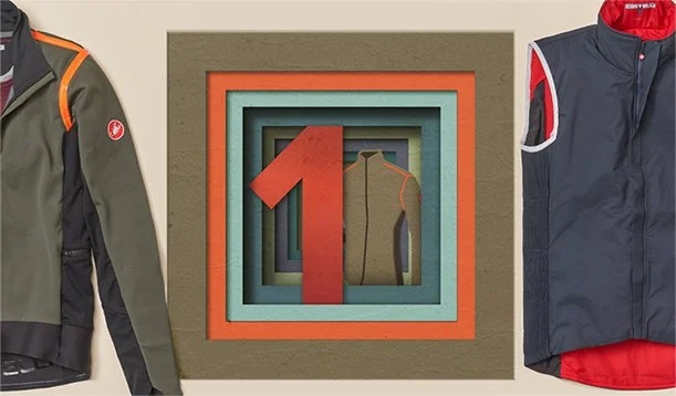
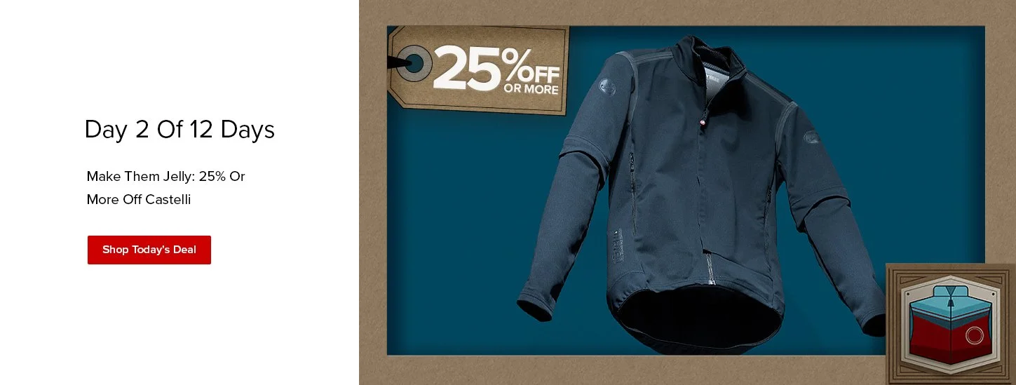
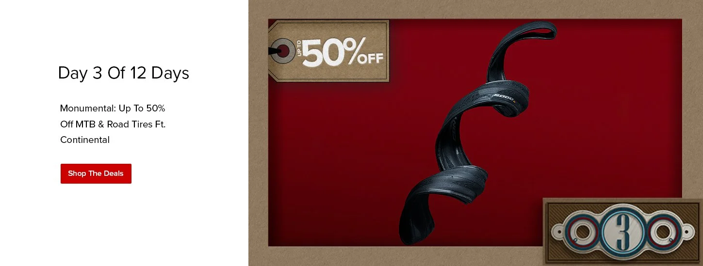
Day 1, Castelli
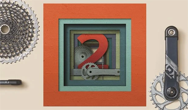
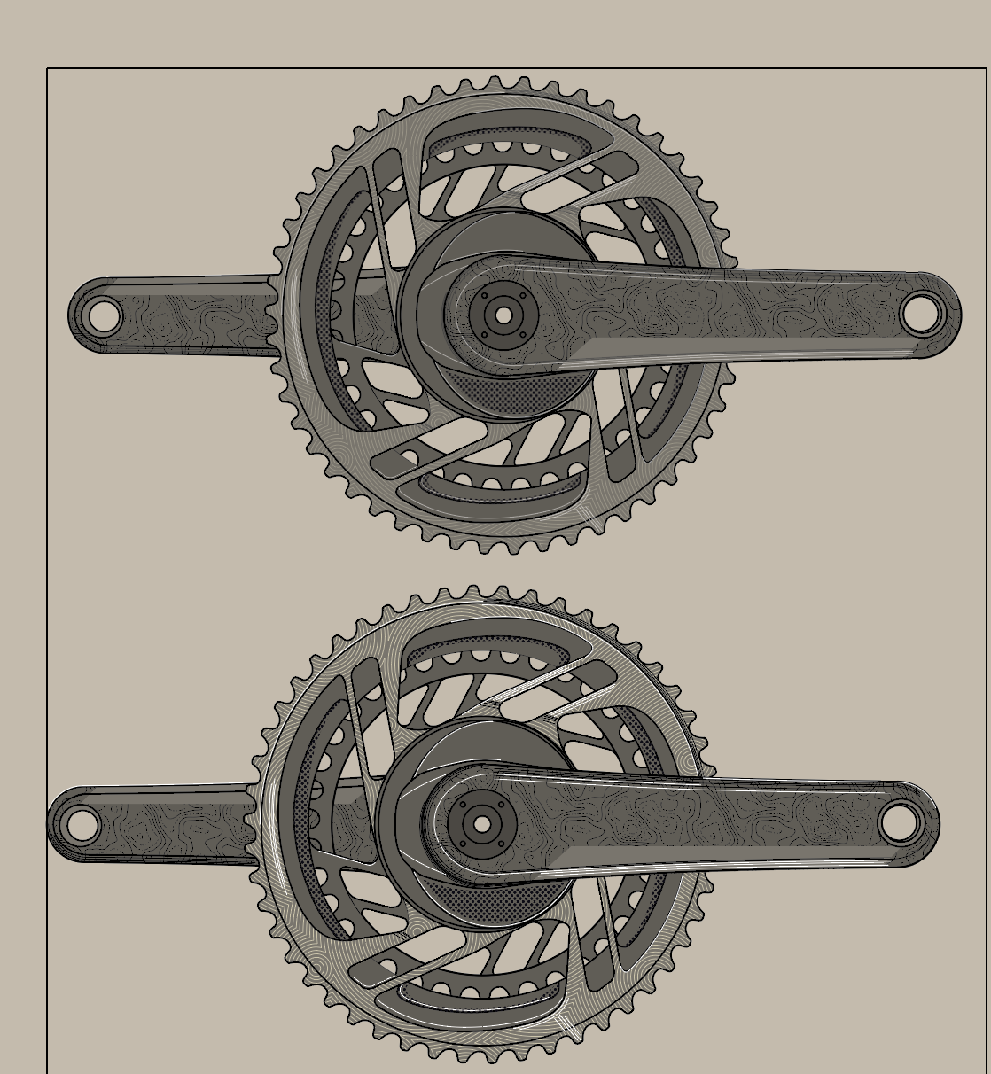
Day 2, MTB Drivetrain
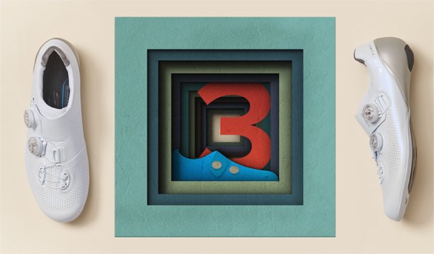
Day 2, Shoes
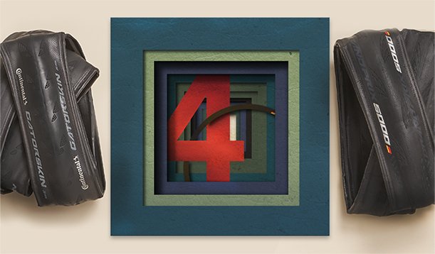
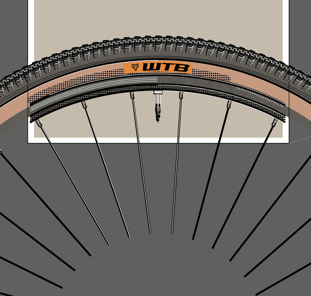
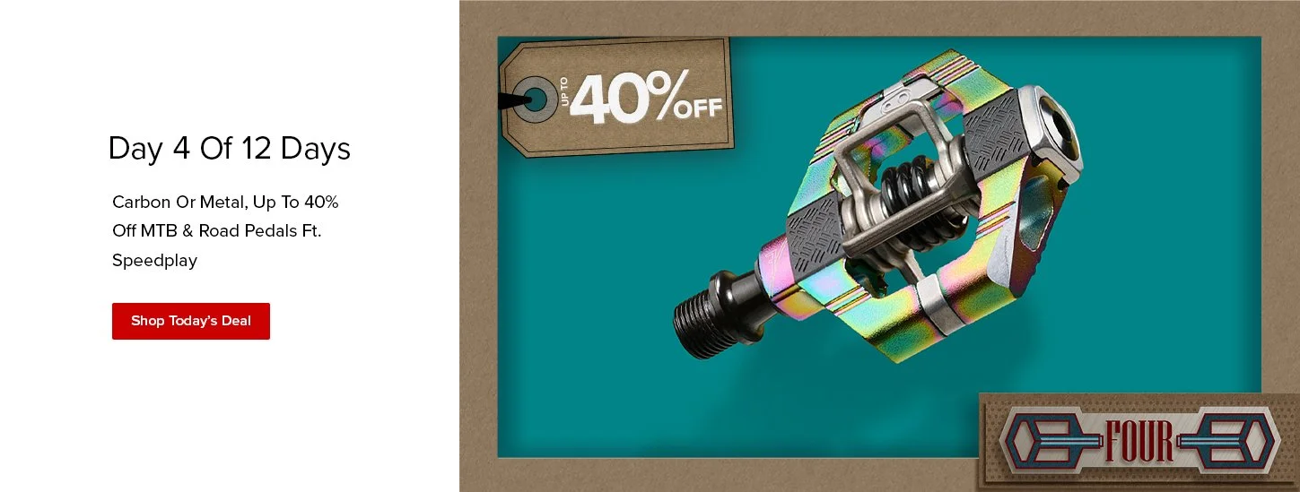
Day 4, Tires
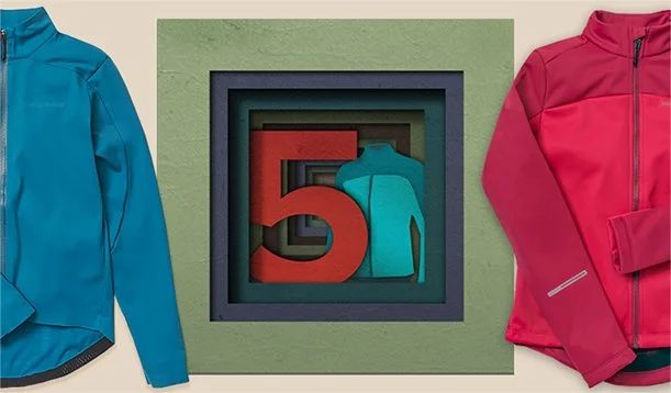
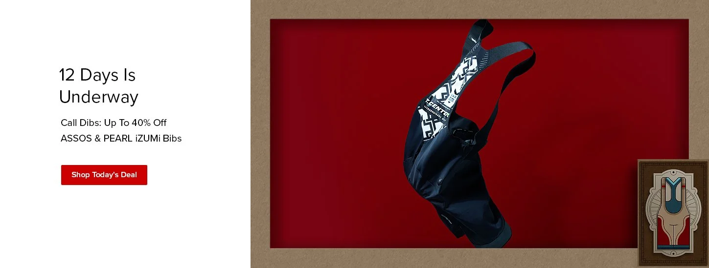
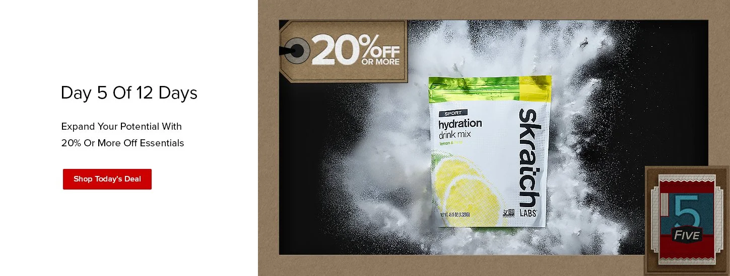
Day 5, Pearl iZUMi
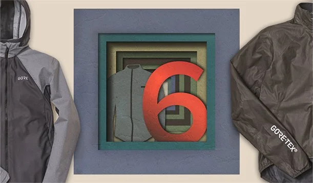
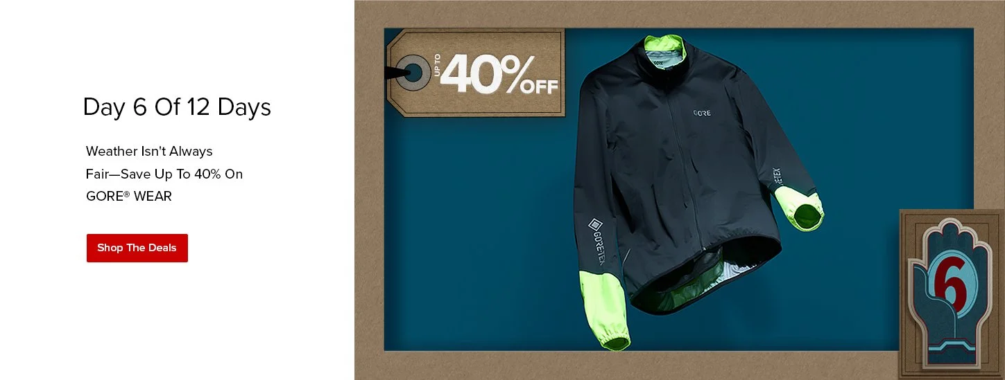
Day 6, Gore
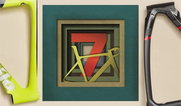
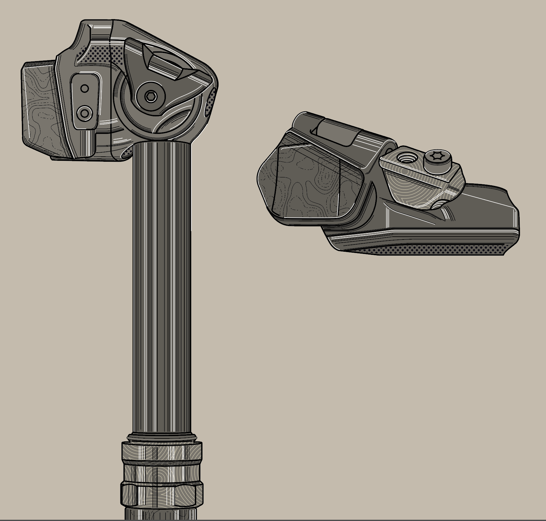
Day 7, Frames
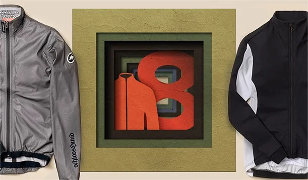
Day 8, Assos
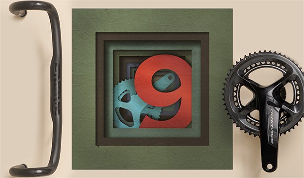
Day 9, Road P&A
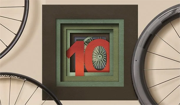
Day 10, Wheels
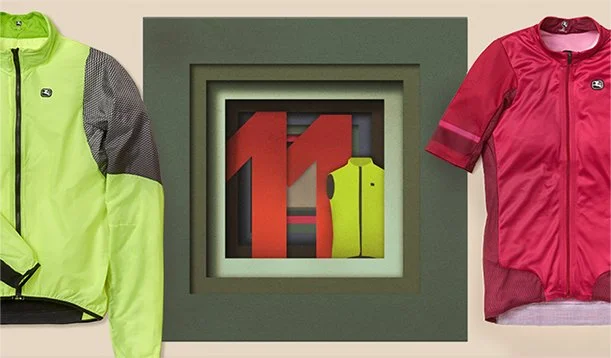
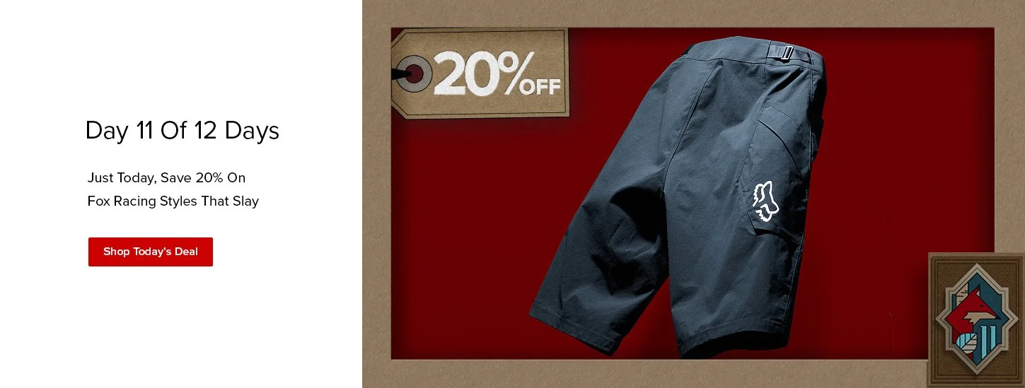
Day 11, Giordana
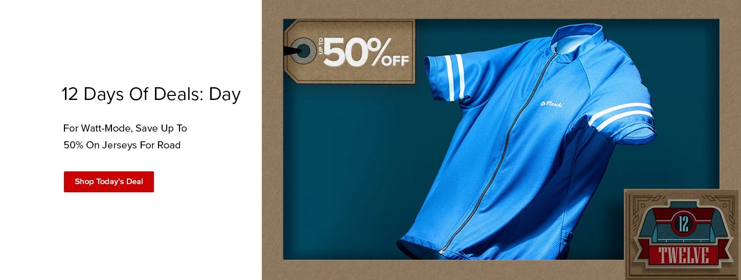
Day 12, Accessories
‘21 had more of a budget and time. A lot more planning. I reached out to some of the illustrators that were featured in Art Crank. Ellen Schofield, and illustrator and educator in Minneapolis, MN fit the work we wanted to do best. She provided the flat art & Photoshop files that I could manipulate later to fit our needs. These had a feeling that was fresh and more clean. We already planned a new photo shoot that would be elevated from our typical flat-lay knolling and bird’s eye view of the product. The illustrations needed to match.
I applied a new color palette that would pair with the photography, type was to be similar to our other lockups we were using that year. I was able to not only animate the type in future emails, but other elements of the campaign.
2021

Launch day. Day 1 we launched with our top selling products; Assos & Pearl iZUMi bibs. For the shoot, we shot with the the bibs against a seamless taken from the palette I created for the campaign. Using strobes and our stylist, Lauren, tossed the the apparel up in the air. Originally I thought of rigging these, but after some experimentation, we opted for less post production work.
Later we were asked to create a % lockup to get more attention on the discount. I wend back and created hang tags that would communicate this more effectively while aligning with the art work.
12 Days Organic video post
2023
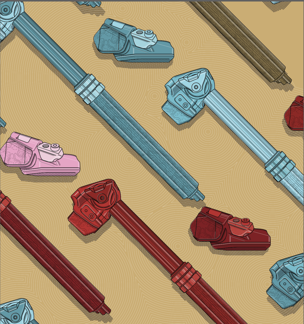
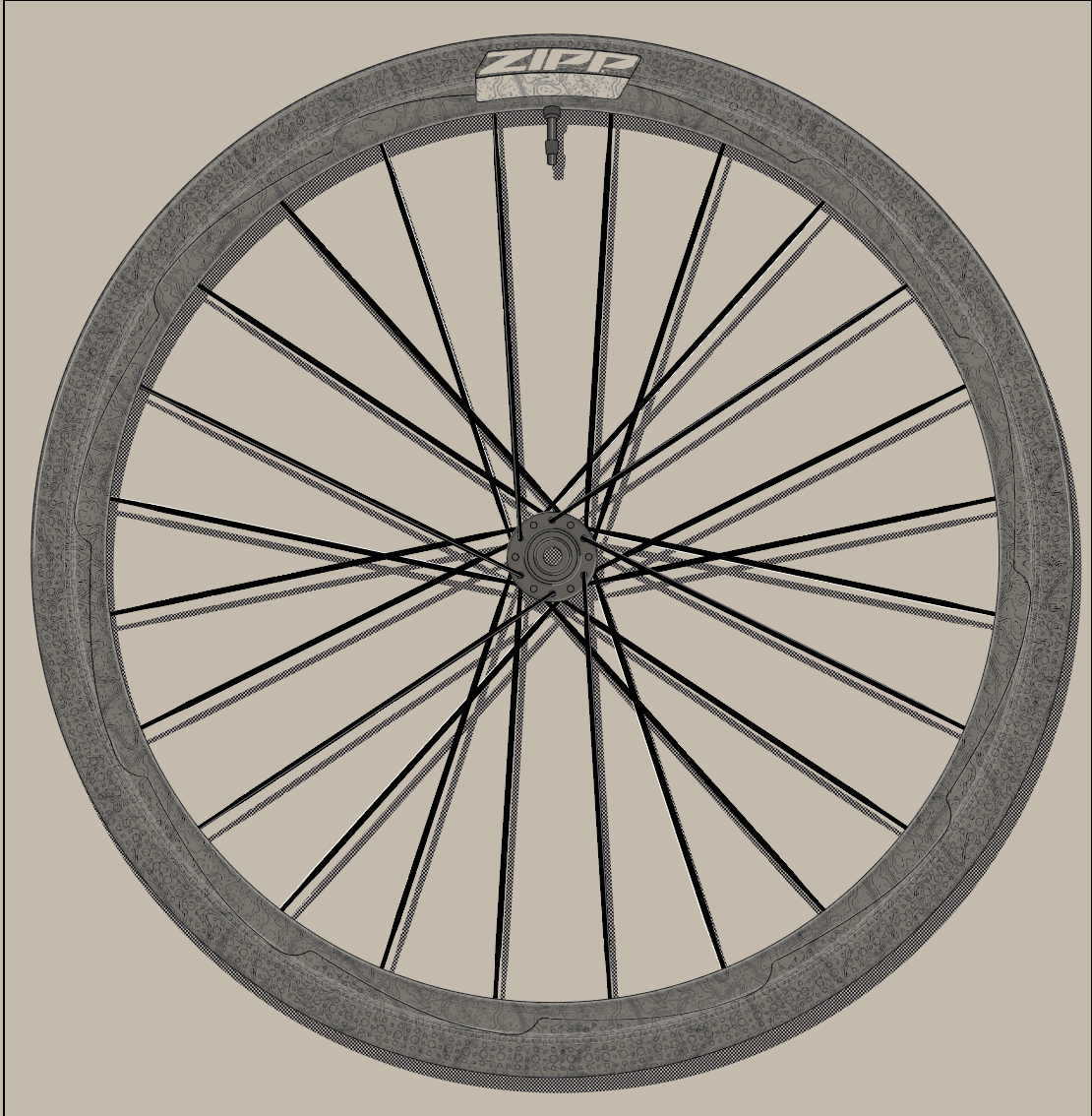
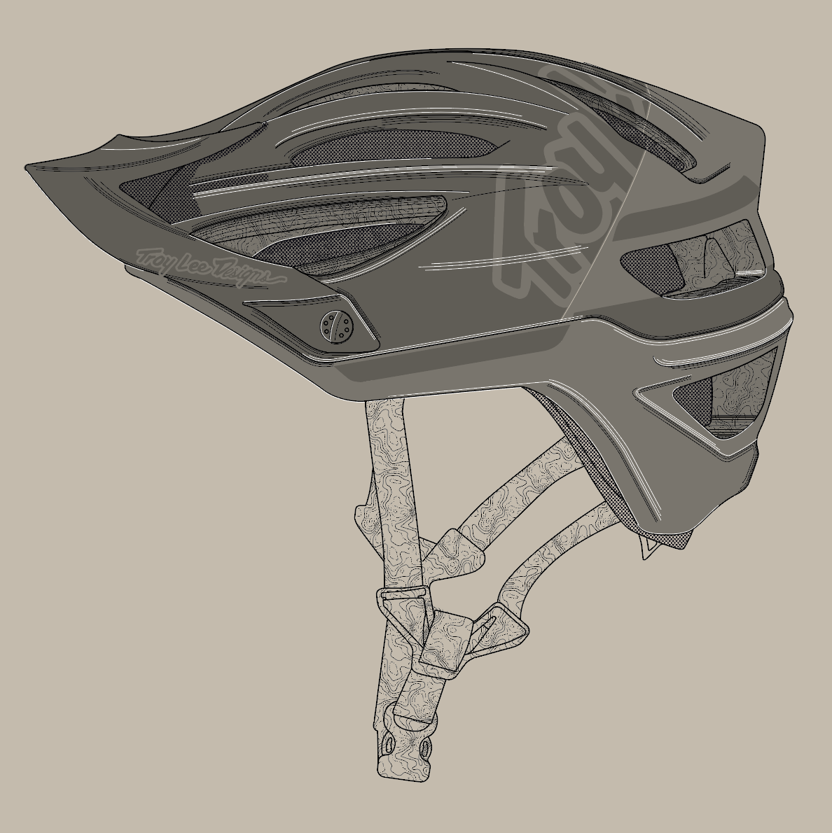
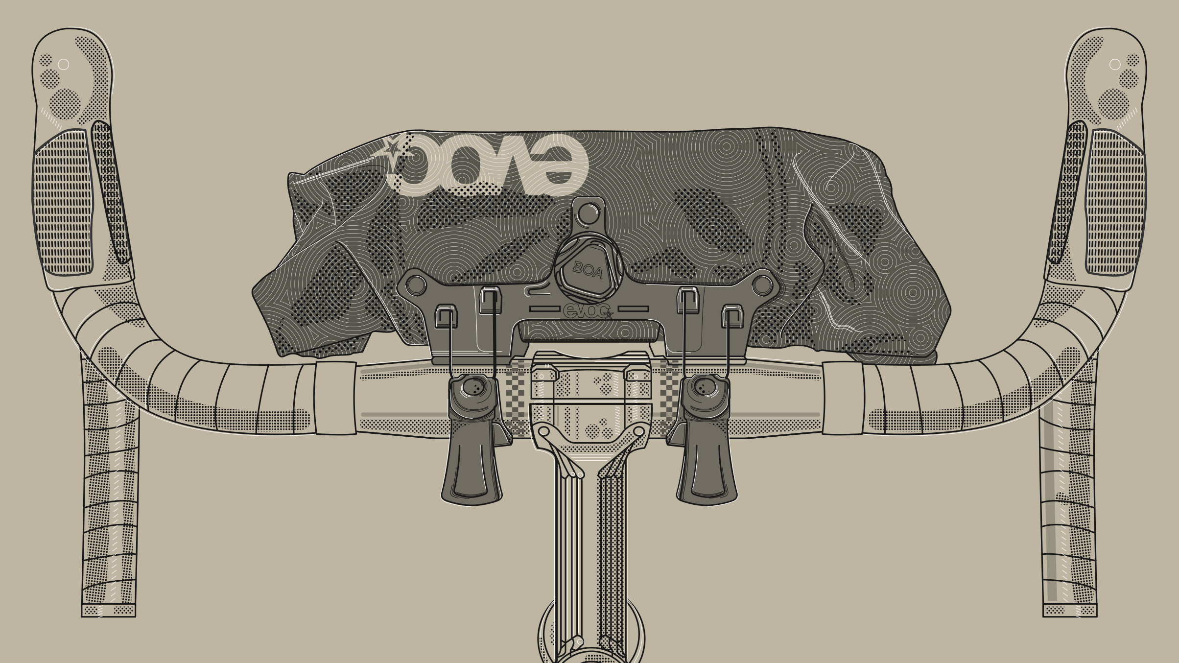
3 years into doing the 12 Days Sale for Competitive Cyclist, I felt that I could do another set of illustrations or at least repurpose some from previous work with did with Bicycle Crumbs. Budgets and time were a little tight, so I felt the need to do the work without external help. A few last minute projects popped up and time was thin for me, so we loosened a little money and felt it worth while to once again summon Crumbs!
Since this was a rush gig I was to handle the coloring and arrangement of the work. Crumbs could draw up black & white product shots. We sent him a few of the products that needed drawing that we didn’t already have and had him add some new treatments to ones that we already did. The result was over the top.
We only had a couple of weeks to turn this around. With some late nights, Crumbs was able to deliver some stellar work that I put into the context of the sale.