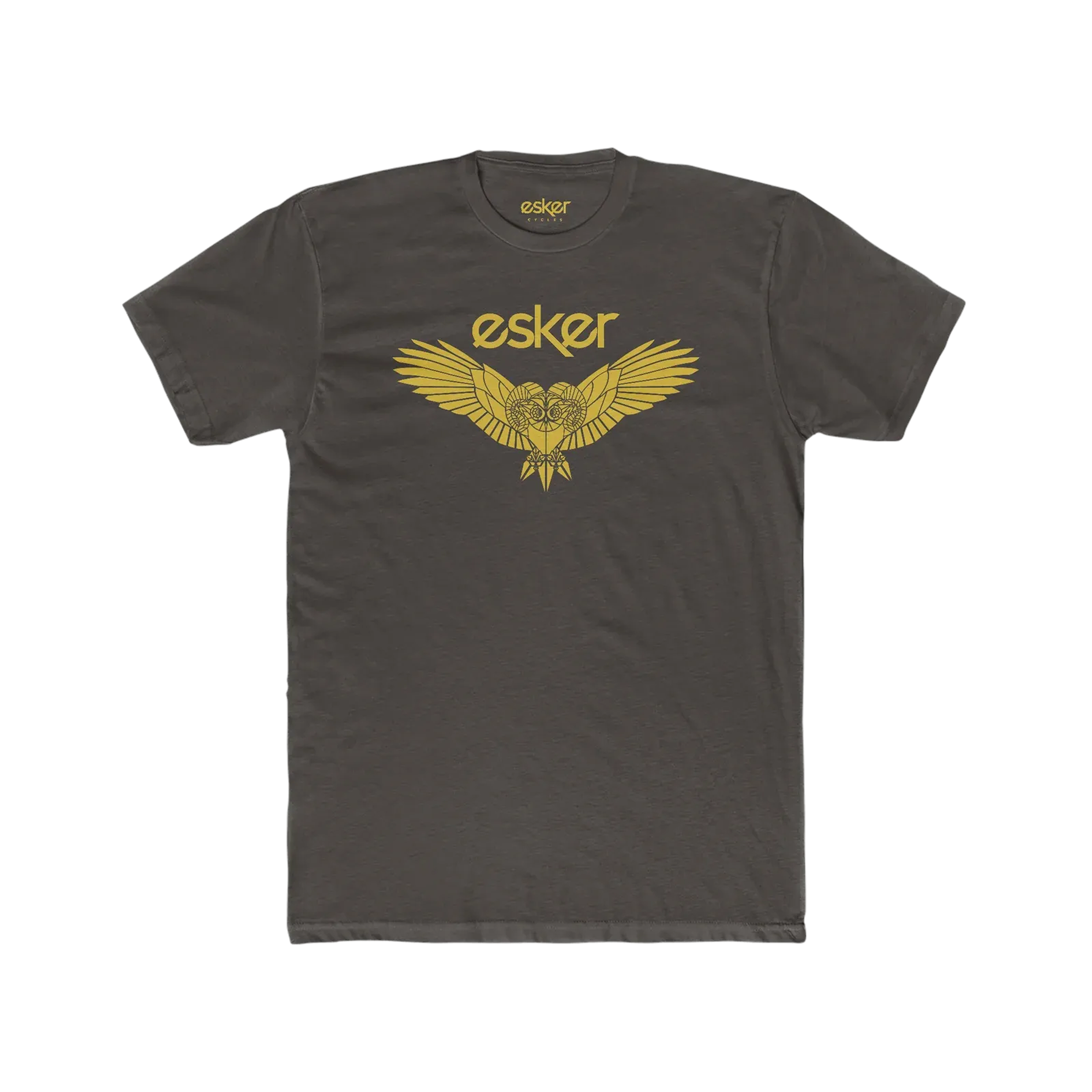
esker cycles
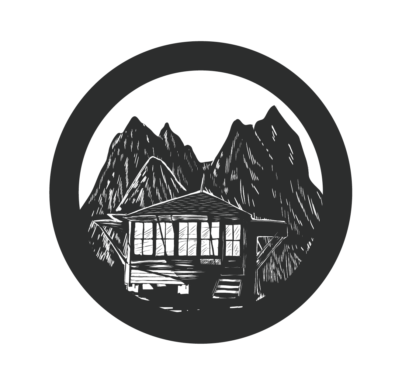
Esker Identity
When Tim & Ryan Krueger left their respective brands in the bike industry, they got started on creating a tire company called Terrene. Terrene was made for mountain bikers, by mountain bikers. They needed some reworks to a logo and help making an icon for it. I was fortunate to be able to help them with that project. Not long after, I was contacted by Tim again to get started on a totally new brand of bike frames. They already had the name Esker Cycles. They wanted it to be an approachable mountain bike brand. They didn’t have any intention of expanding on mountain bikes at the time. Still, they are dirt specific, making steel, titanium and aluminum frames.
My task from the inception was to create the complete identity of Esker that later led into making color and finish choices for the frames, icons for the bikes and some of the components that created a cohesive feel.
Wanna-be type designer
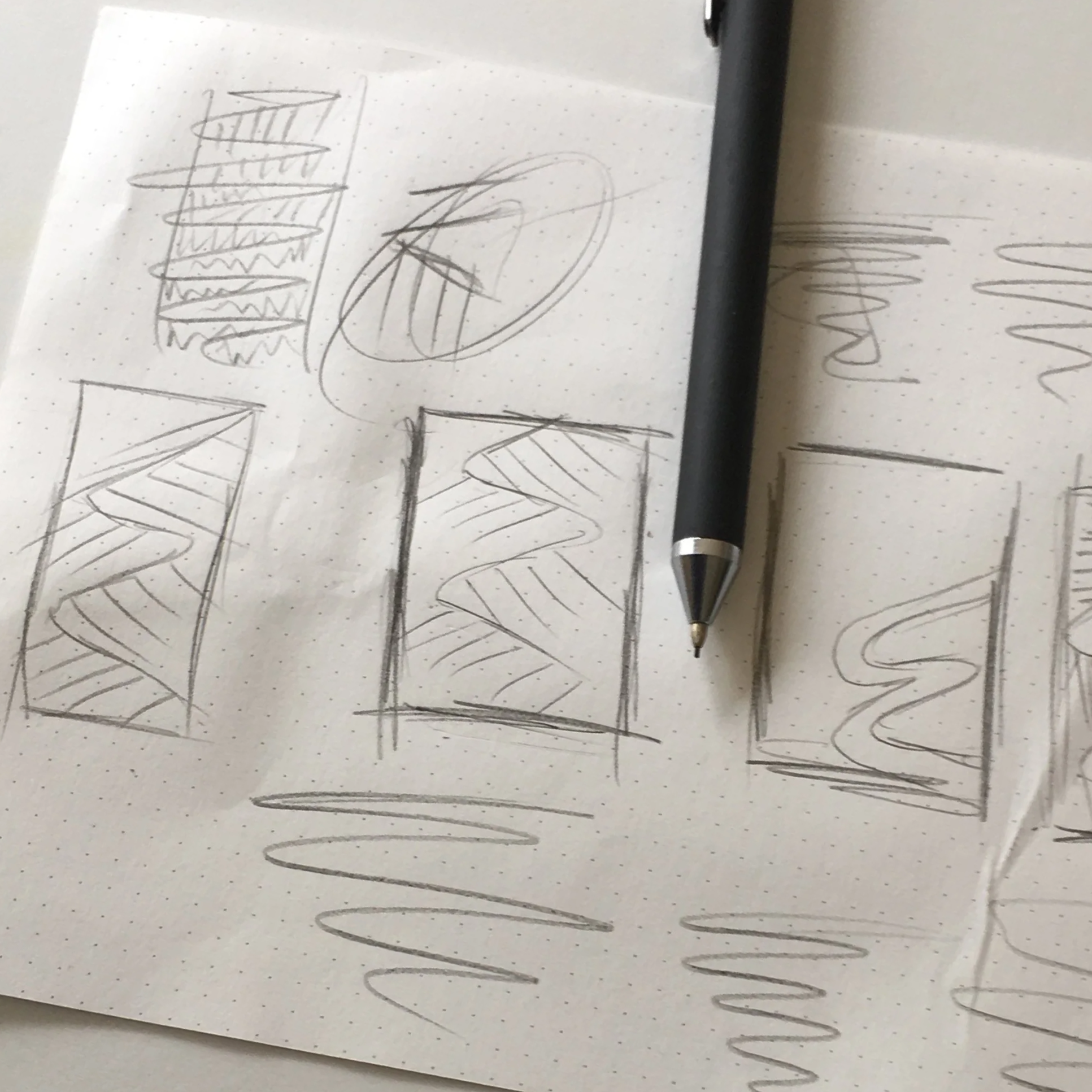
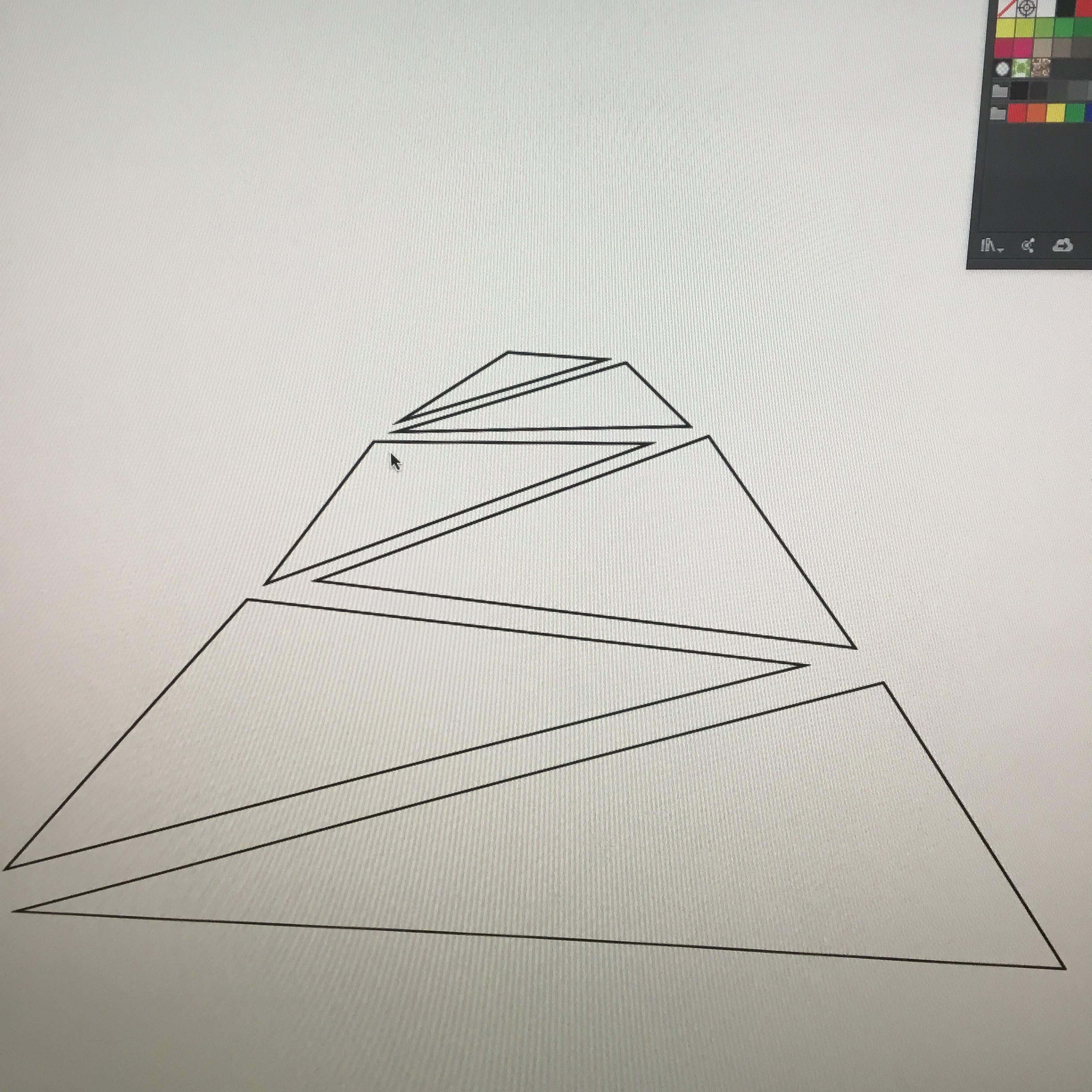
It was 2017 when I designed this logo. I already had plenty of time to design a typeface, at least. I just never had the opportunity, or the excuse to make the time. Looking back to when I had more creative time, I probably should have. When I was a kid, I would draw graffiti (of course), but before that I called it “creative writing.” I laugh about it now, but I would draw interesting letterforms and alphabets based on album covers, skateboards ETC, but never did I think I was making type. Fast forward, I had some typography classes, I had even made a font in a class with Chank Diesel back in the old design school days. RIP to that on a ZIP disc somewhere in a landfill. This is all to say that I had a basic knowledge of how to create type.
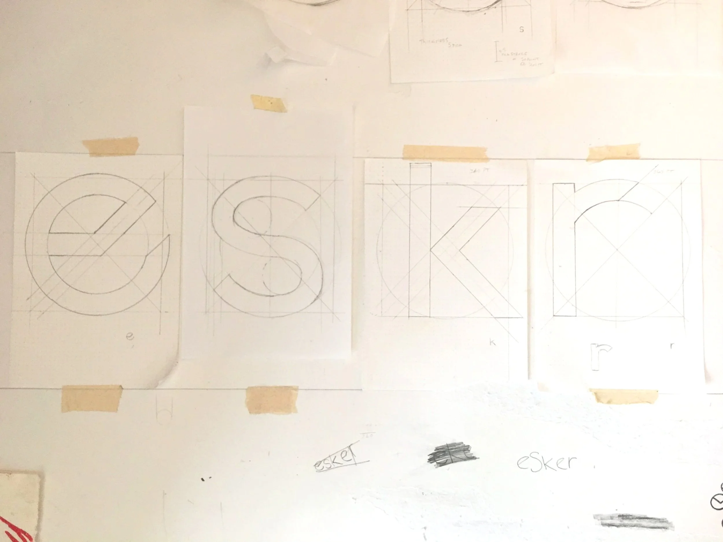
For Esker, I wanted this to be an original typeface that one could see and recognize at various scales. The one request was that the wordmark be lowercase. I felt this was a little flimsy, but I wasn’t going to argue. So, I studied a number of fonts and their typefaces. Looking to inspiration from Tobias Frere-Jones and a number of my favorite gothic typefaces that you’d see on the open road, I began to sketch ways this could look and show up on bike frames and stylized in a minimal way. Most of all, I was looking for minimalism. The bike industry was too full of maximalist logos.
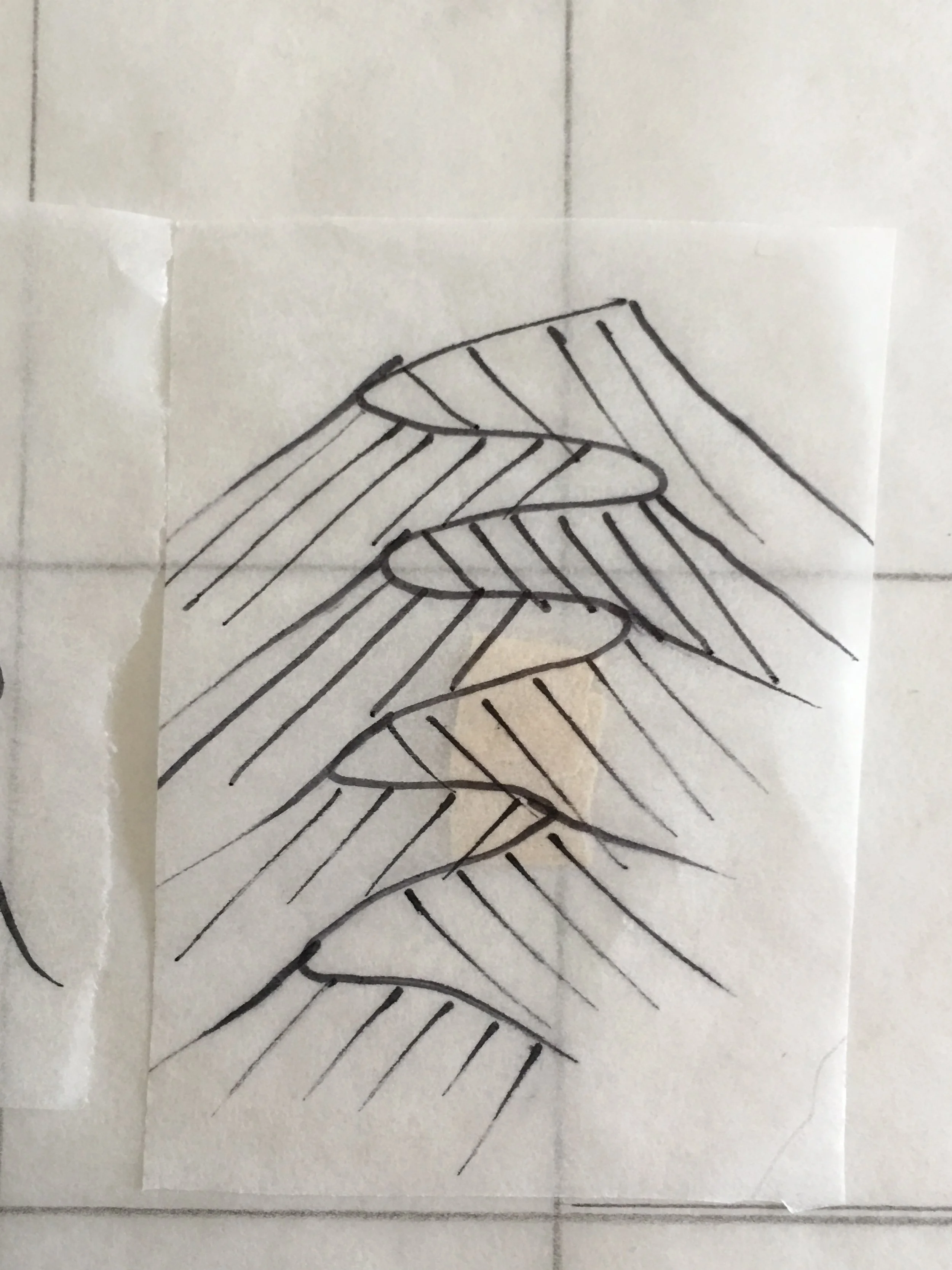
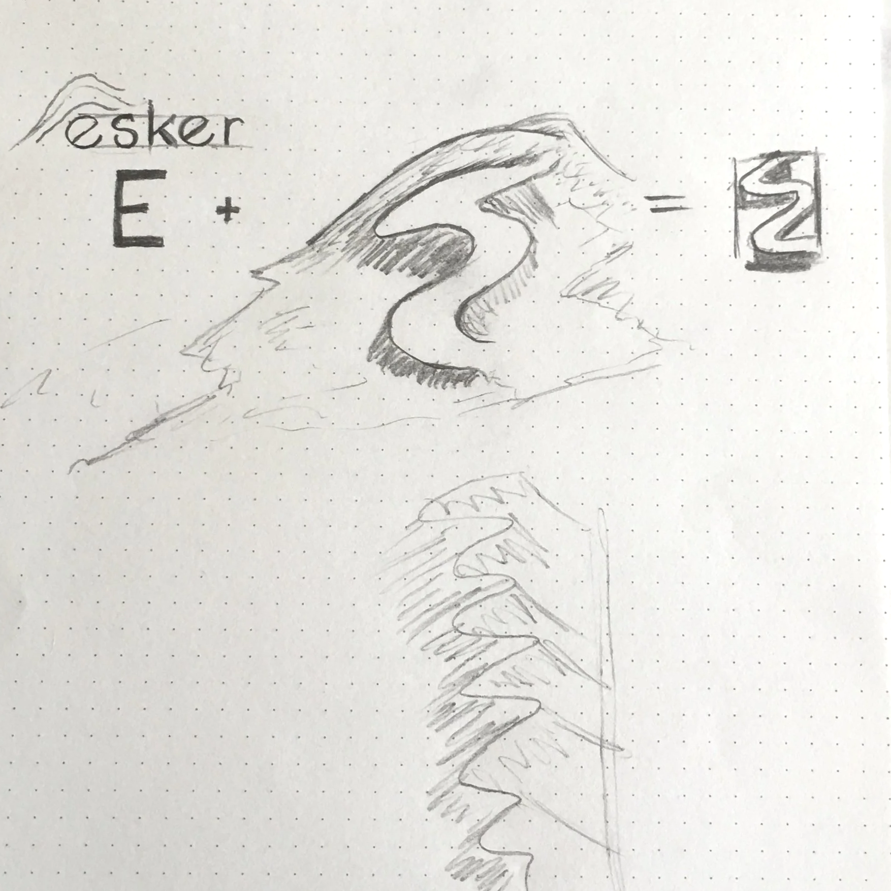
As you can see in the image above, I drew the type from scratch and played with the E to see if there were ways to make this more ownable. Once I put it to Illustator and traced it, it didn’t feel right. The movement wasn’t right. So, I rotated the lowercase e and extended the stroke. This gave a geometric/organic feel that I was looking to. Eskers are in nature, S shaped and rounded but have an edge to them. The S and the E needed to work in this way also.
One of these days I’ll finally make the full set of type. There are a few edits I wouldn’t mid making now that I’ve seen it all this time… TBD
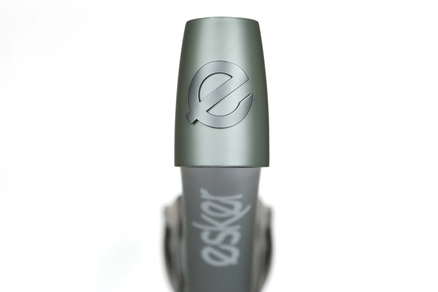
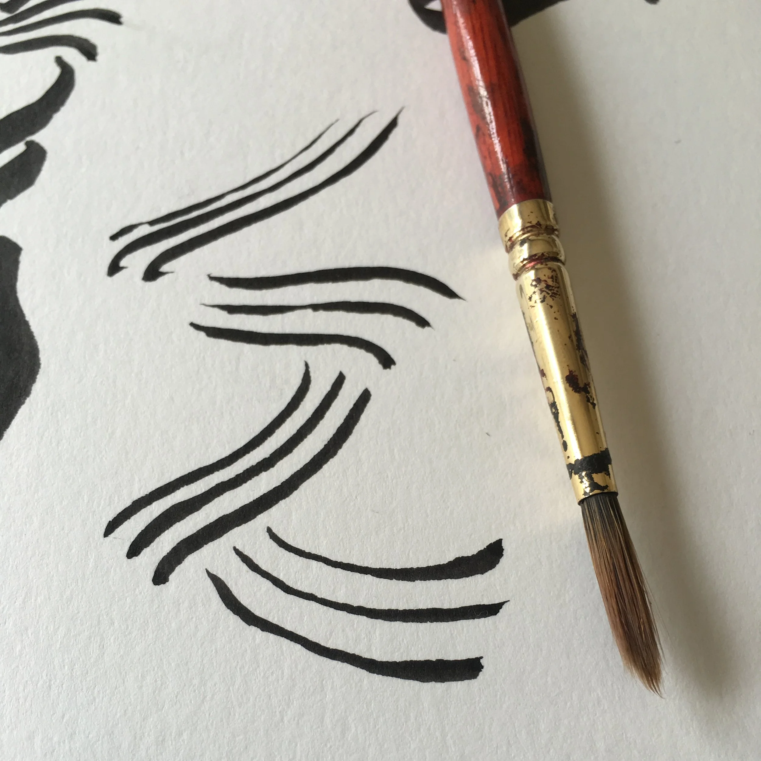
Final logo once traced in Illustrator.
The best part to this project was eventually riding the bikes that I put my work into.
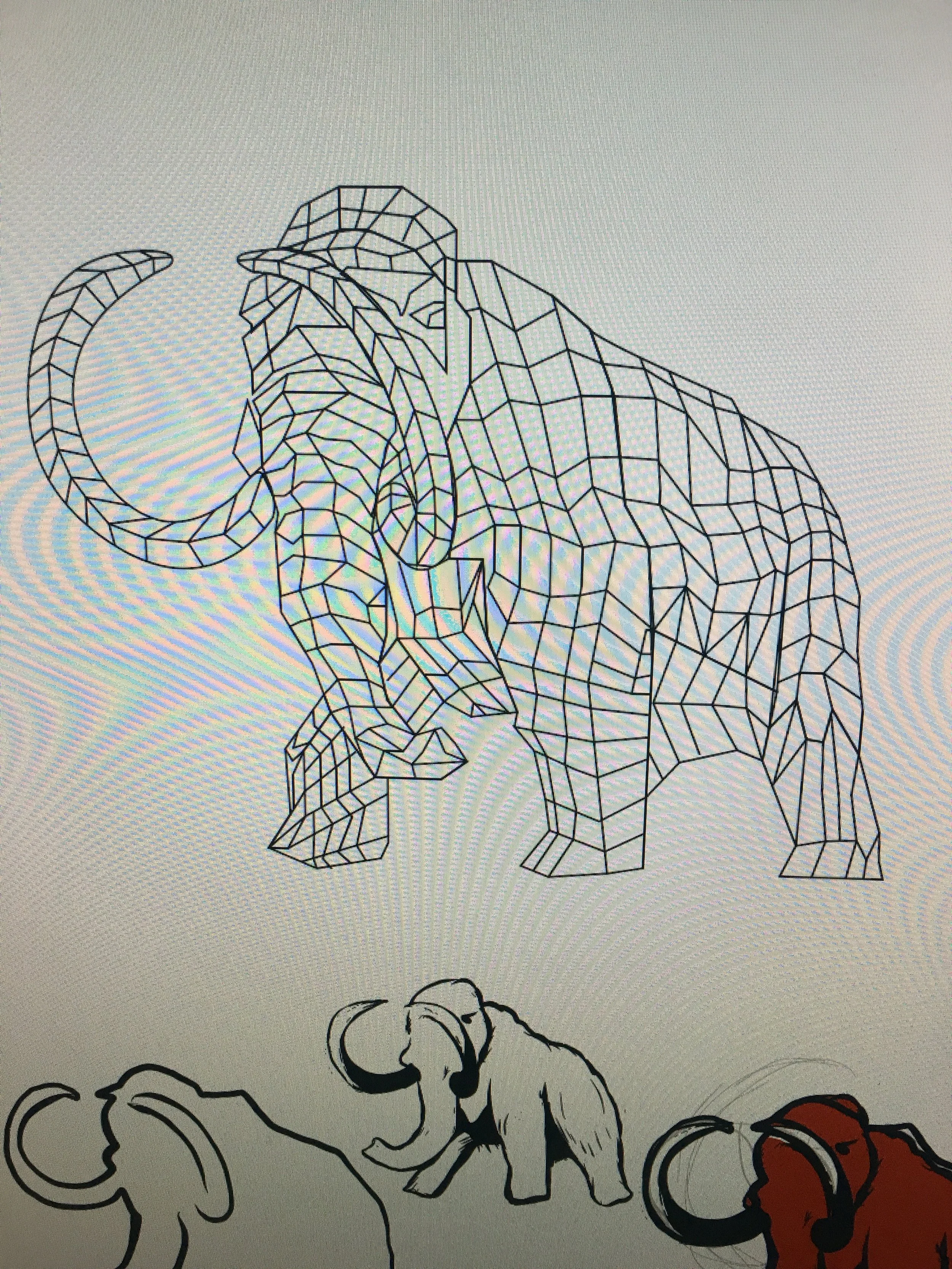
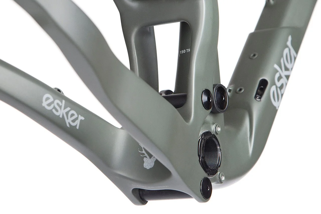
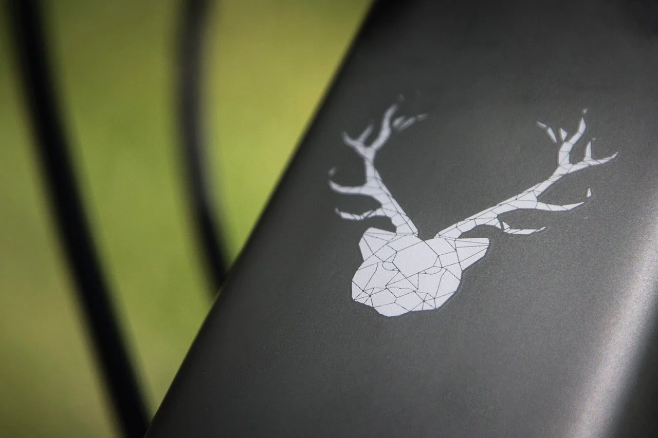
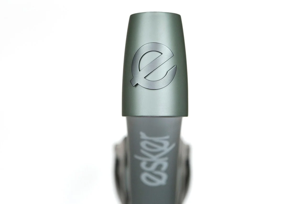
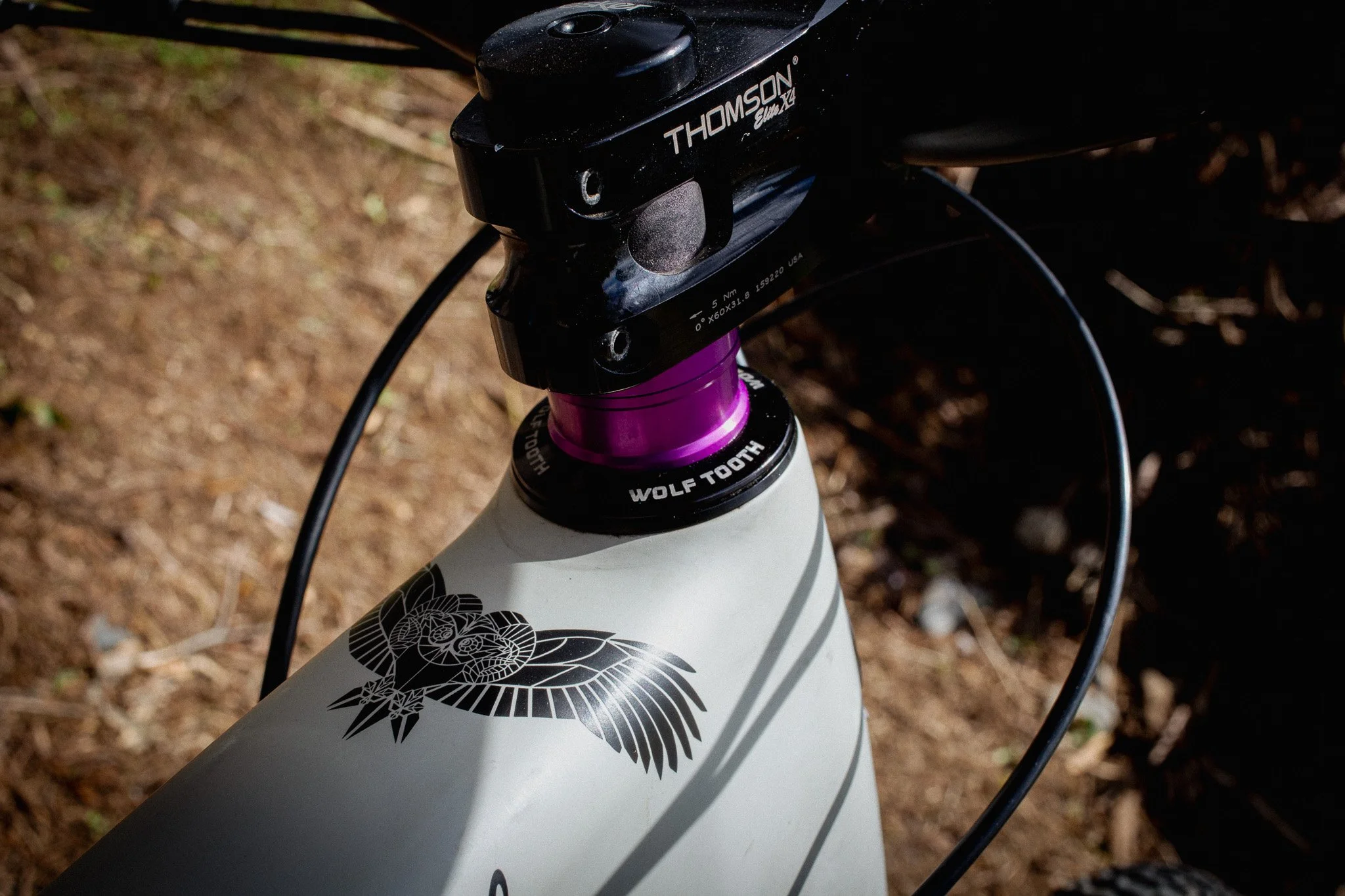
A small part of the head badge exploration. I wanted this to play off an actual esker, but work with the e portion. At the end of the day, we just needed the ‘e’ because this represented the early phase of the brand best. It was easy and ownable. We could always revisit. Part of my exploration was also looking into the ice age creatures that lived in our region in the driftless where eskers were so noticeable.
Forgive the moray of the image. It’s all that i have left of this exploration. The mammoth would have also made a great headbadge, but wasn’t right. That said, it wasn’t unusable. We latched on to the idea of taking these illustrations and creatures and give them to the bike frames and products. the mammoth graphic ended up on Esker’s Epoch handle bar that I cannot for the life of me get an image of, so here’s the mammoth.
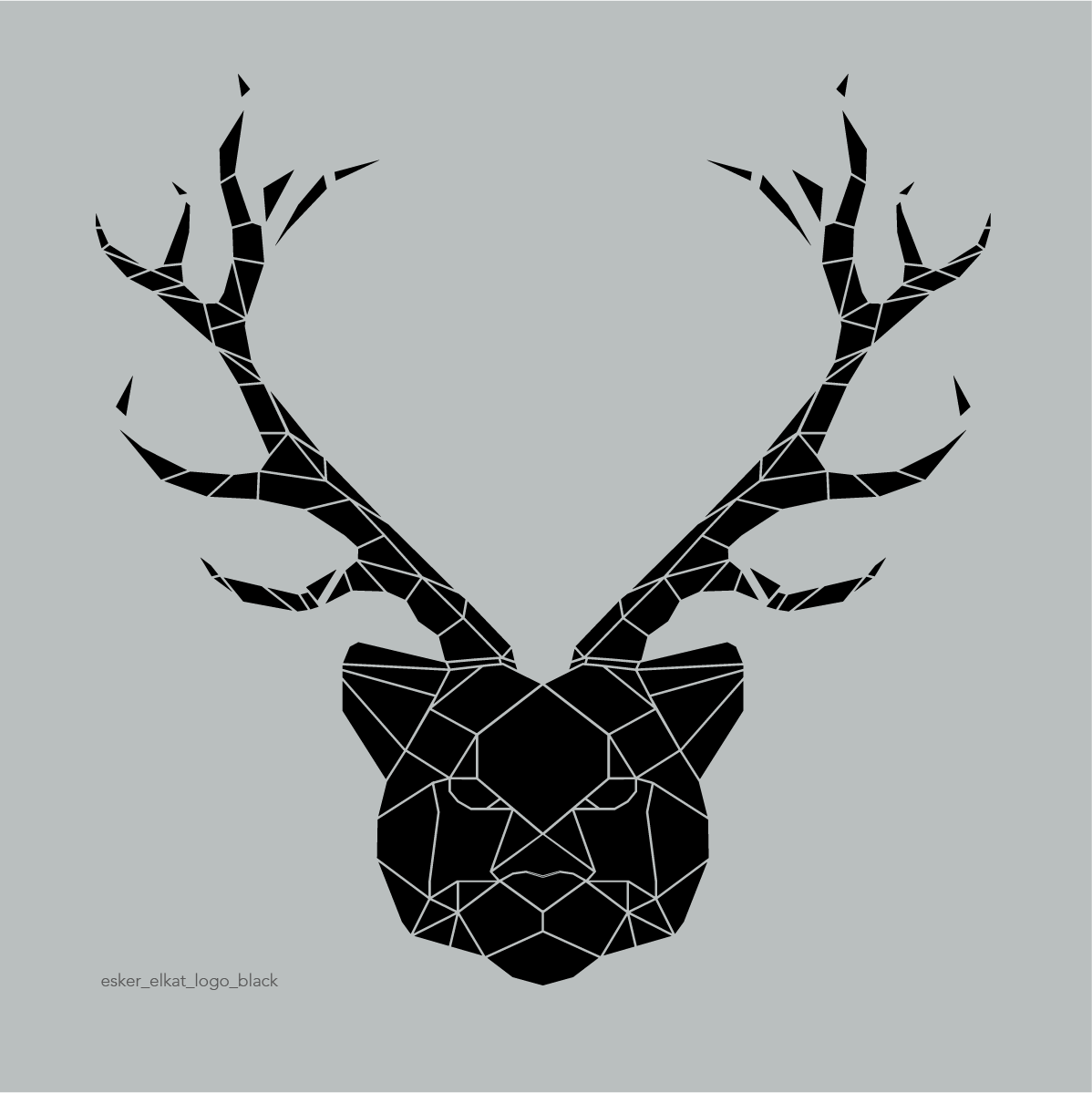
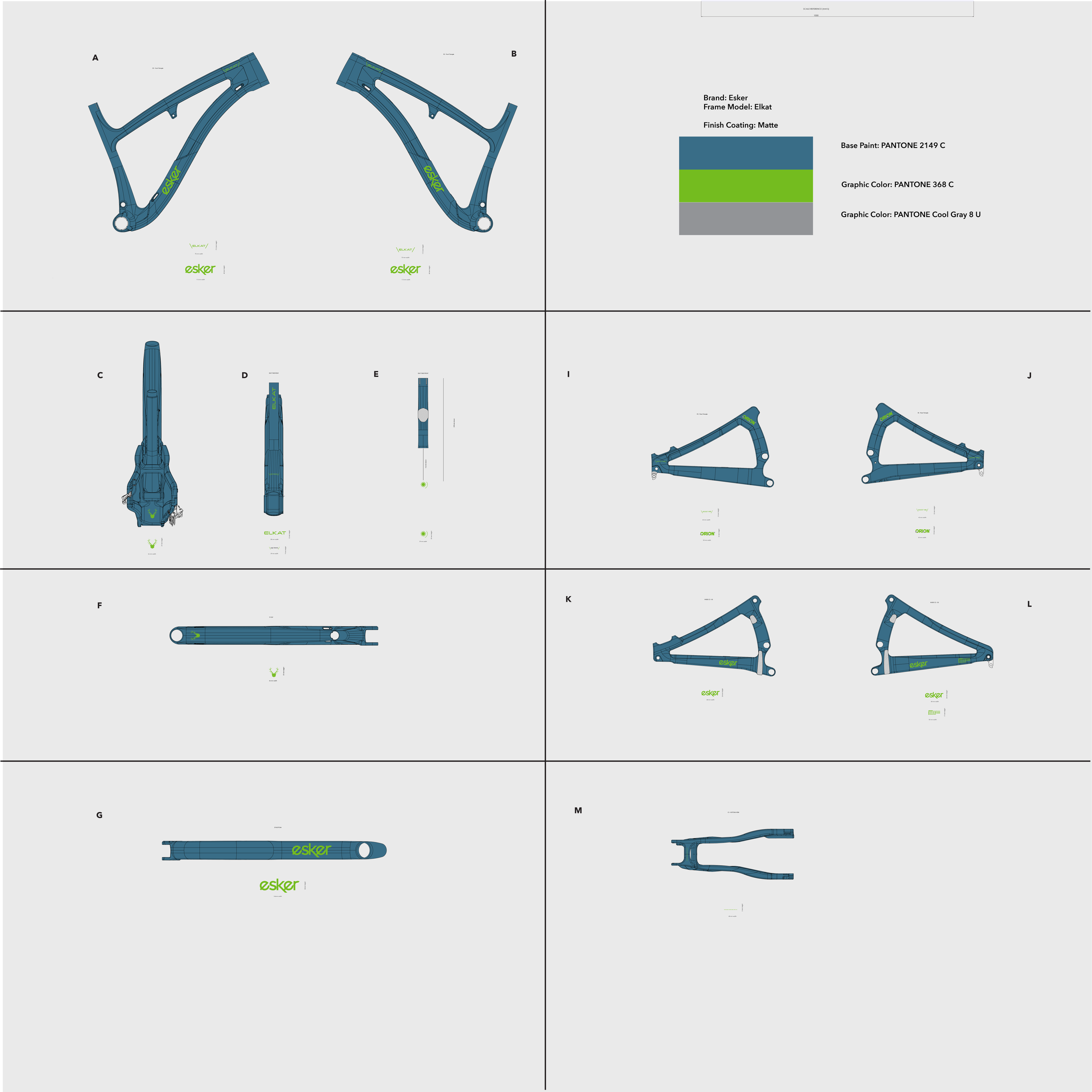
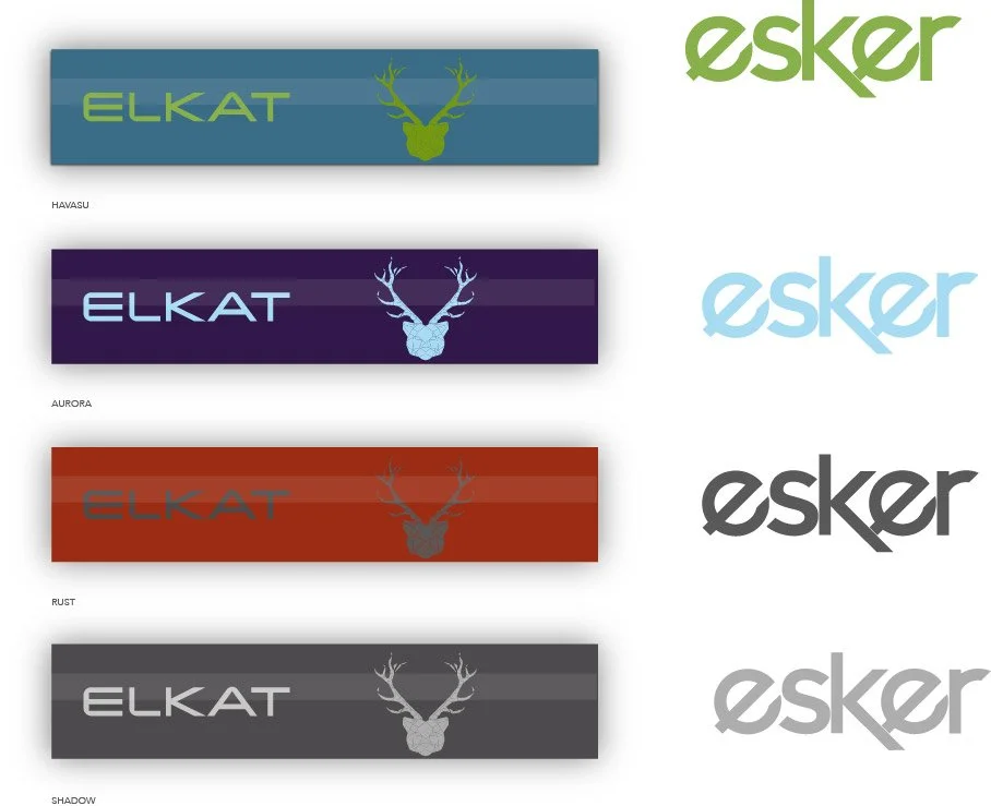
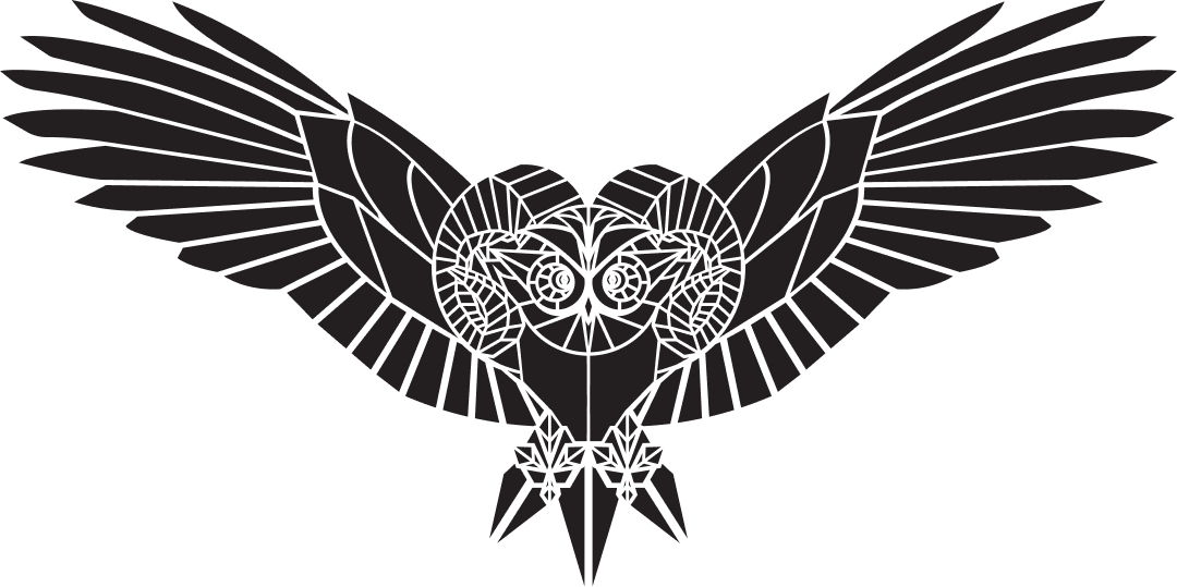
The Elkat
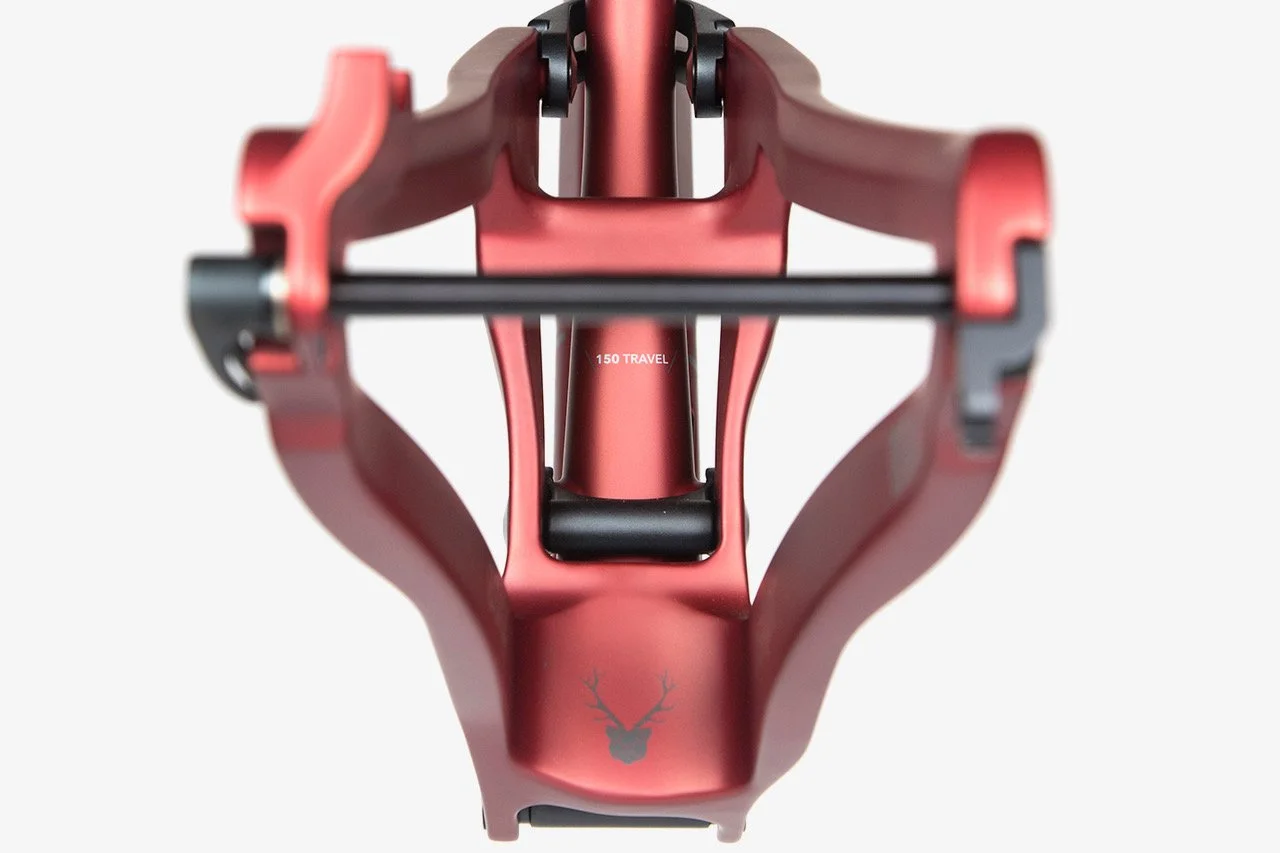
WTF is an Elkat? It’s a mythological animal made from an elk and a cougar, of course? Okay, so it’s not a mythological creature, but it’s basically the description of this bike. Big and stable, but quick and agile. I won’t get too nerdy with the specs of the bike as I wasn’t the engineer on this, but I did get to create the animals/badges that belong to each frame. The idea was that each bike gets a story or some kind of animal associated with it that gives a hint of the attitude of the behavior of the bike.
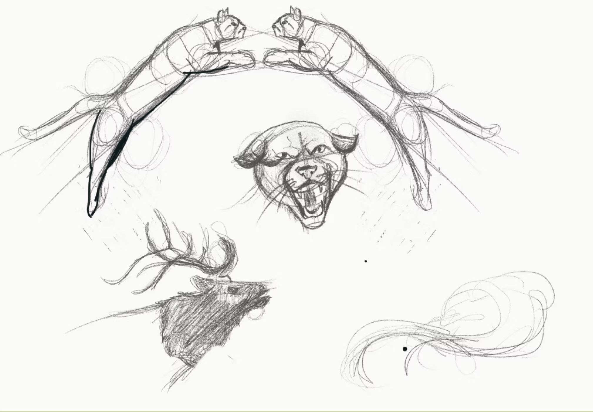
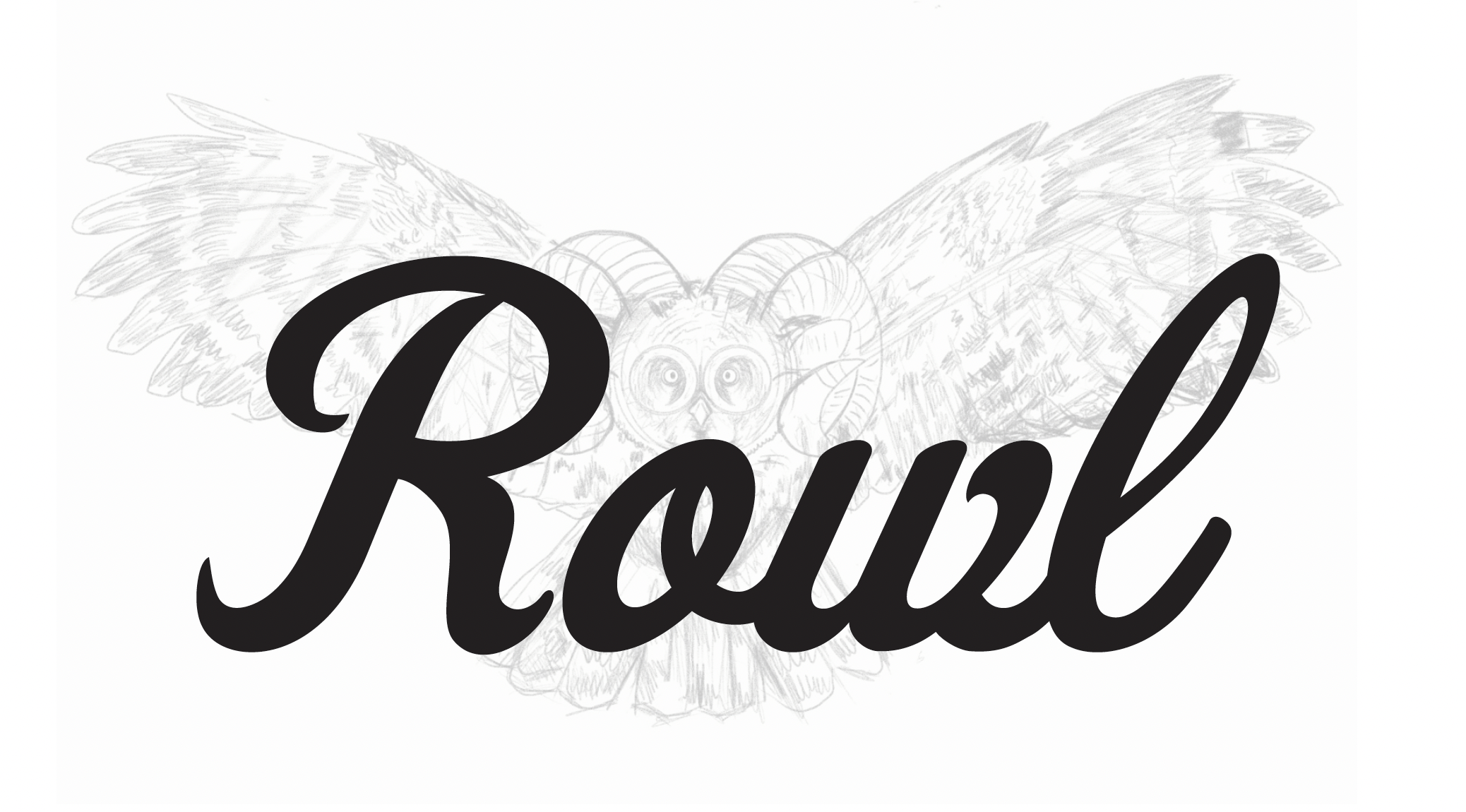
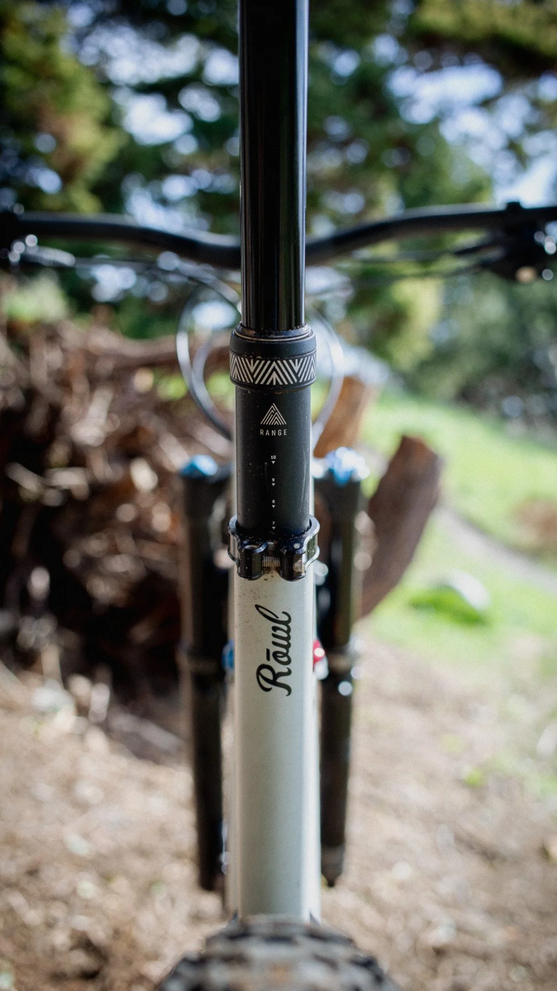
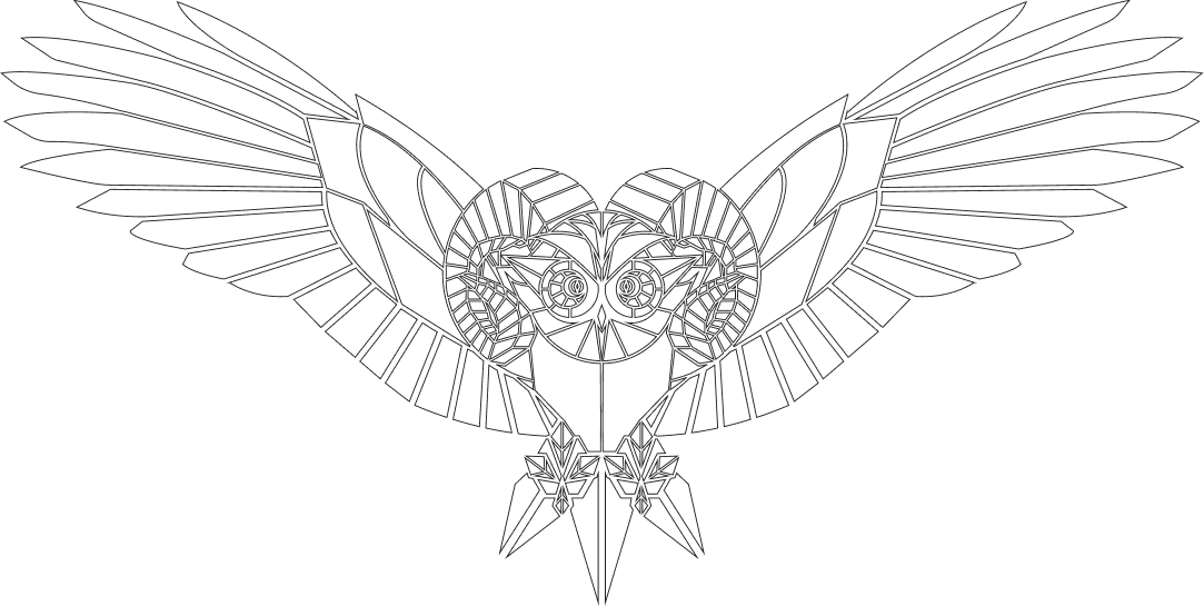
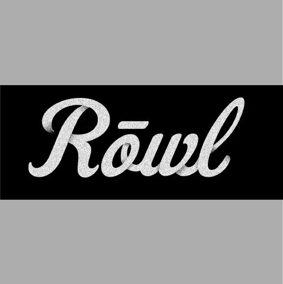
The Rowl
Catching on to the animal blends? Originally, I was asked to create something that represented an owl and a bear. I worked on this a little and decided that I would propose not using the two because the name I was coming up with was the Bowl (Bowel is how it would end up pronounced). There had to be an owl in there somewhere. I really pushed for an ibex. Obex was my proposal. It sounded like something that could exist, but finally we ended with Rowl. The Ram meets the owl. Great description for a 29er do-it-all bike.
The Whole Package
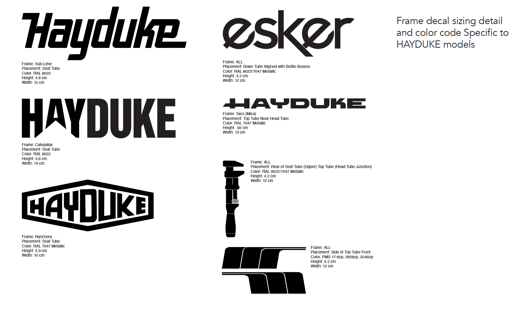
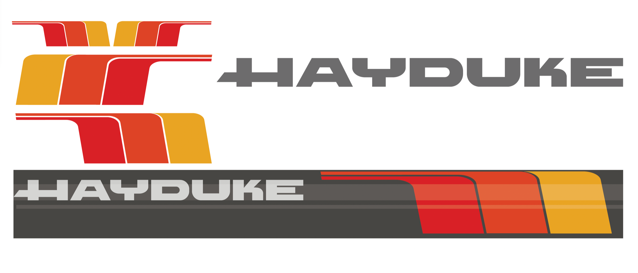
Following the launch of the Rowl & the Elkat, we also needed to make updates to the existing Hayduke. This bike was not only getting graphic overhauls, it was getting updated to the tubes, geometry etc. It also needed it’s namesake monkey wrench.
Following this, the Hayduke would have another literary sibling, the Japhy. The Hayduke was more of the do-it-all trail bike and the Japhy was built more to explore distances. Personally, I had a Hayduke and it had an attitude when it came to being a pack mule. The Japhy would be the more stable version.
Type would receive a variety of treatments on the Hayduke. We borrowed from CAT for the yellow frame and vintage Jaguar for the red. We had a plan to take from the Tacoma letterforms for another color, but I’m not sure that one came to fruition. The TRD stripes would have be pretty sick.
As for Japhy, the Dharma Bum, I wanted to take from some of the covers I’ve seen. It needed to have some feeling or texture to it without it being too literal. It needed to remain simple. After several rounds of type choices and a little play, I ended up knocking the wordmark out from a torn page look
Below are the spec sheets. I no longer have all the photographs, but will drop in here once I can obtain them again. The frames were gorgeous in person.


Guidelines
Finally, once we wrapped up the majority of the work, we would need to build a set of guidelines for the Esker brand. At the time, PDFs were pretty much standard. Now, I’m going rouge and reworking these into a Figma document that can be a true living & breathing document, capable of change to the needs of Esker. In addition to this, I intend to build a micro design system based off the work here. This is all for the love of the work. It’s a long slow process due to this happening in my tiny amount of free-time.
Brand guidelines need to be there for reference, but not be the soul rule book of the brand. If changes are made, adaptions are made due to a changing market, new language is written, logos receive tweaks & revisions over time, new secondary and tertiary colors are introduced ETC. The original work in InDesign was too rigid and difficult to make edits to. I never felt this was fully flushed as we still needed to add to the tone of voice, the visual language ETC. This is was a basic set of rules and references.