2024 Holiday Gift Guide
Key Art Design
Campaign Design
Digital Art Direction
Campaign Design
Illustration
Motion Graphics
Role
Creative Director: Erin Rountree
Senior Art Director: John Klopping
Photography: Ben Khuns
Copywriter: Alex Chavez
Production: Vincent Mauro
Stylist: Lauren Brady
Crew

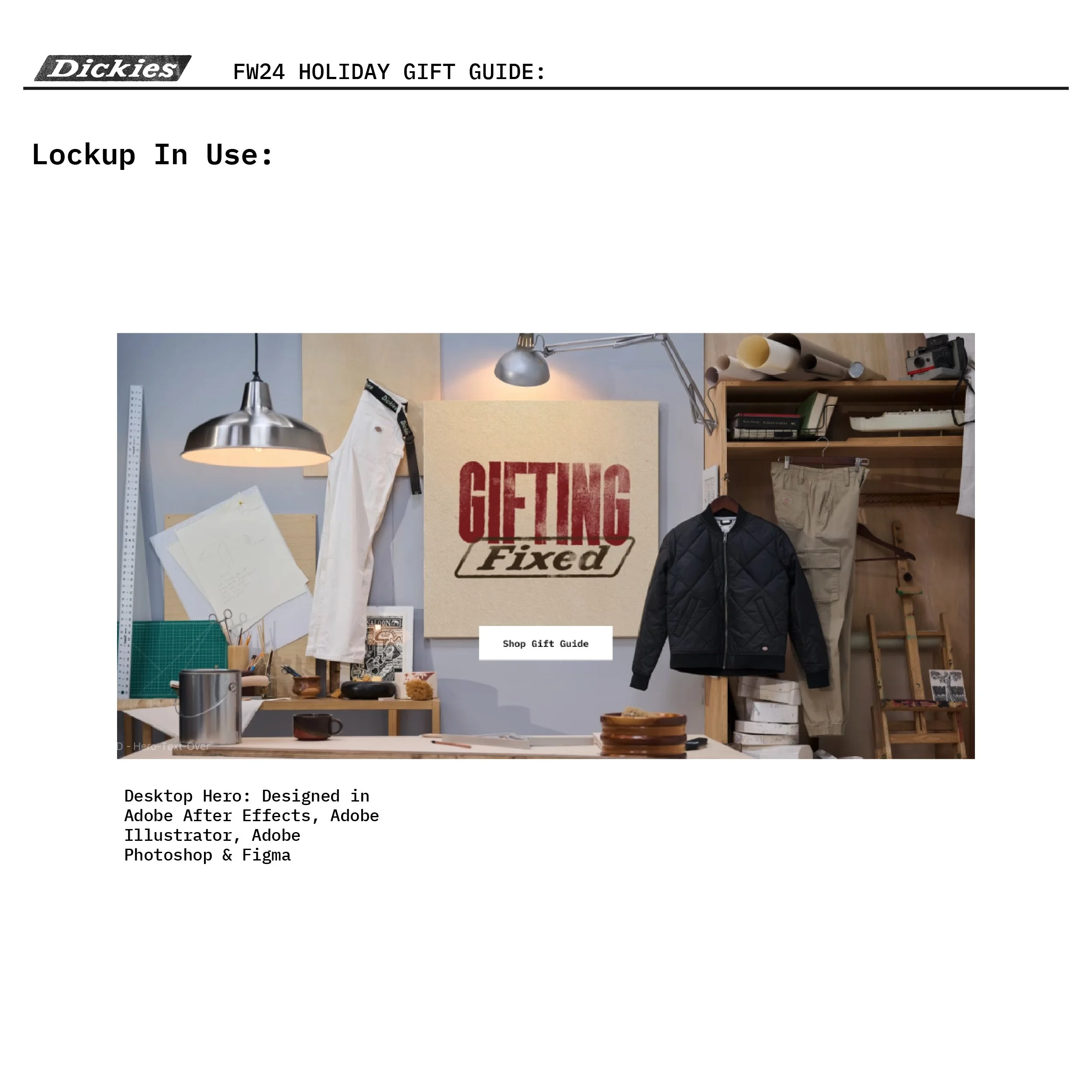
The Set Up
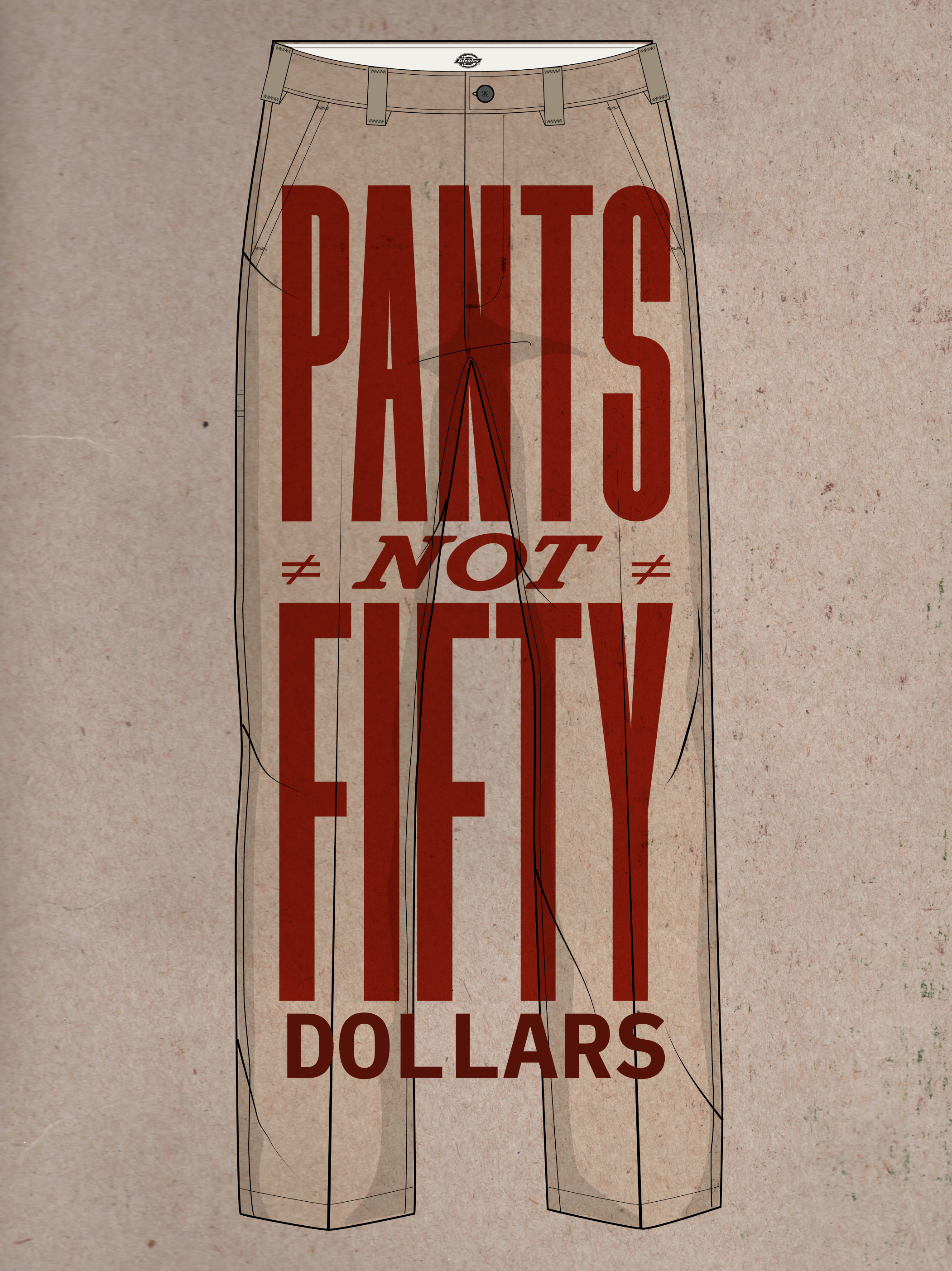
The overall concept was to be an approachable guide to gifting. We originally put up an idea that our apparel is quality at an affordable price and it should be based on the mantra, Pants Not $50. While this was well received, our marketing team at the time didn’t feel like we were in a position to run on that. So we worked on other ways we can deliver this message without being so blunt.
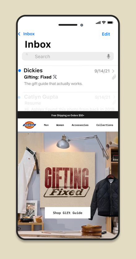
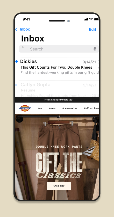
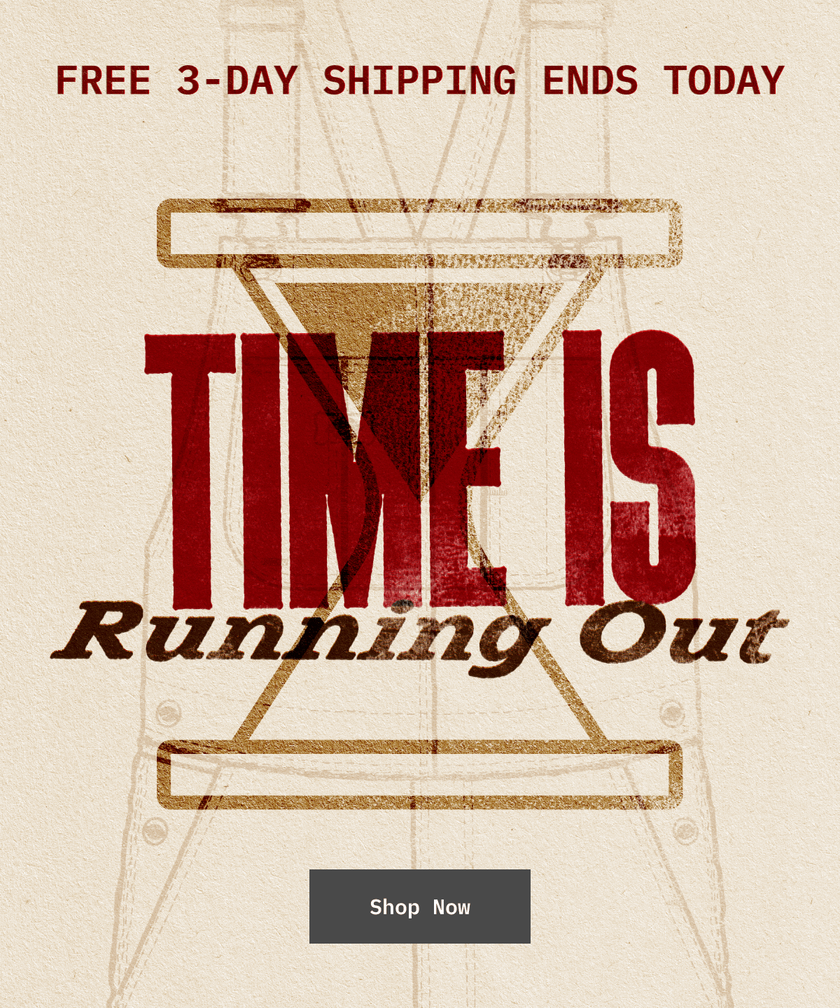
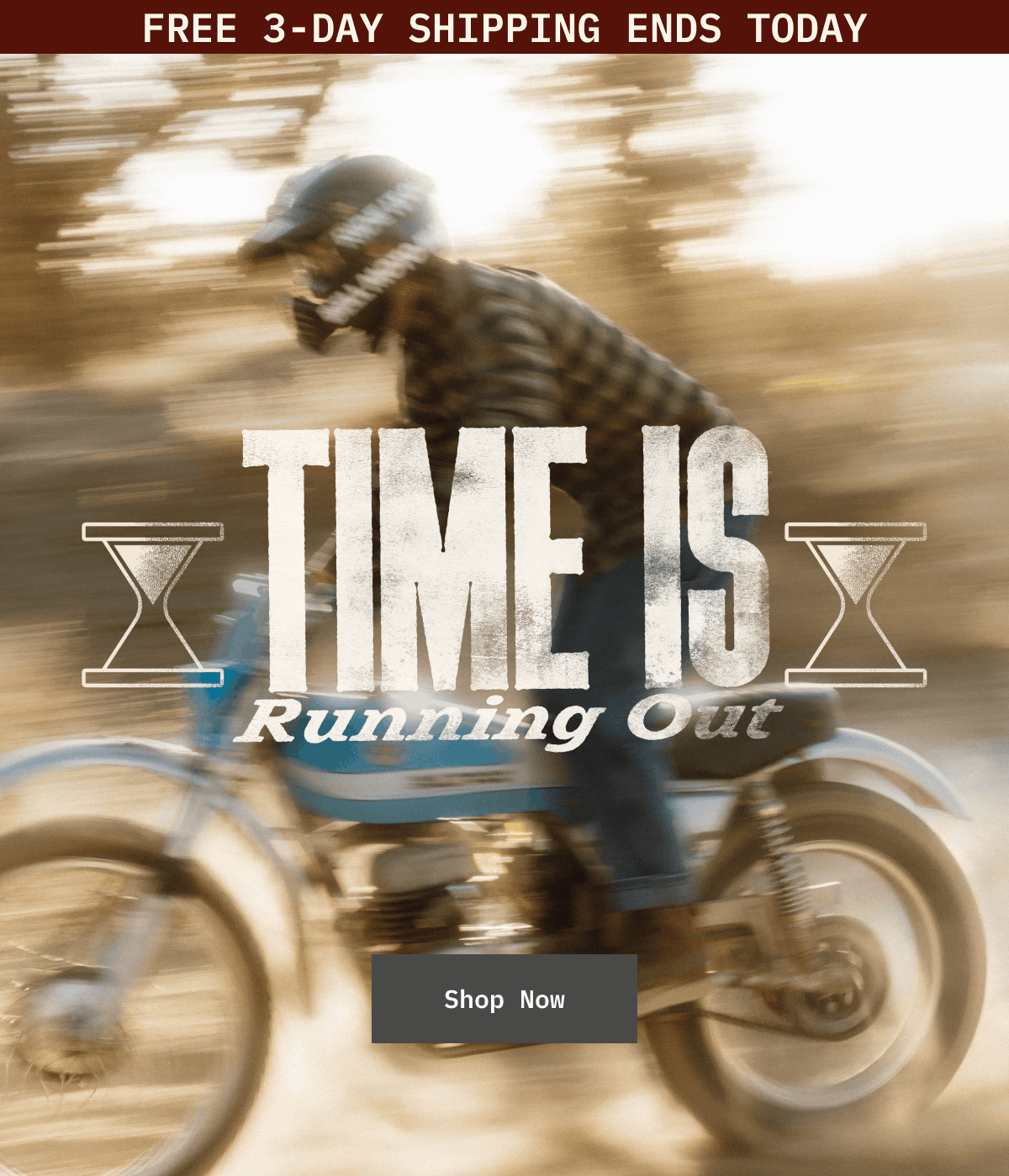
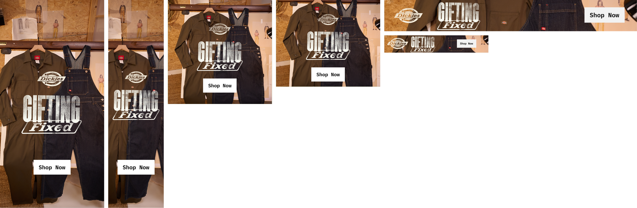
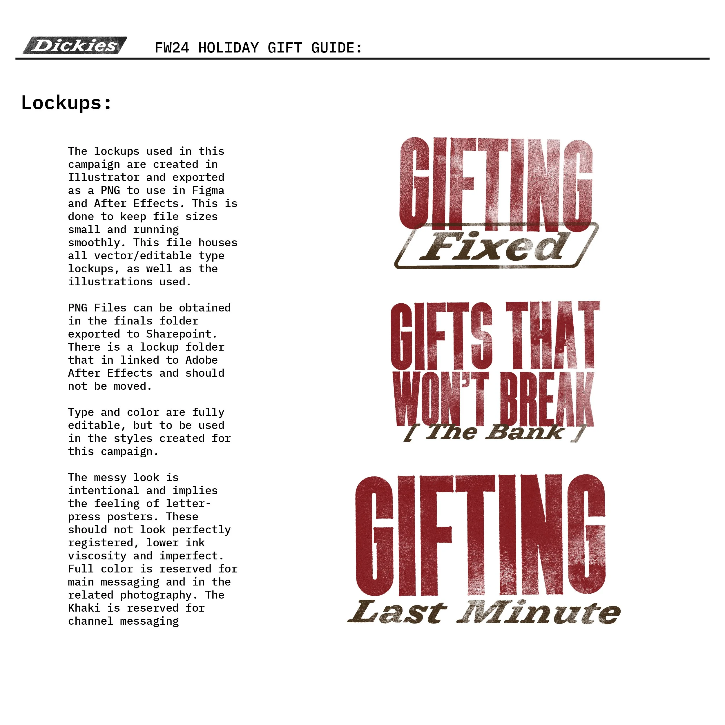
Playing off our core product, workwear, we decided that our key messaging would be Gifting Fixed.
Visual Concept
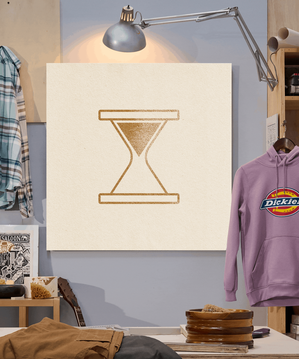
The overall visual was of the made by Humans mantra. Mixed media, illustrative and printed. Imperfect, lived and textural were all the vibe of this. Based on who wears our apparel, what you do in Dickies and how their work space would look.
For the photoshoot, the idea was to build out a set that is a lived spaces. We had different campaigns to shoot into and different moments that needed to stand a part. Holiday Gift Guide Phase 1, Black Friday / Cyber Monday, Holiday Gift Guide Phase 2. We did tiered pricing—shop by $, our Icons and staff picks.
The different spaces were a garage at night for BFCM, studio/workshop for price point and drawing/drafting space for icons.
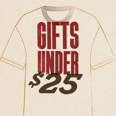
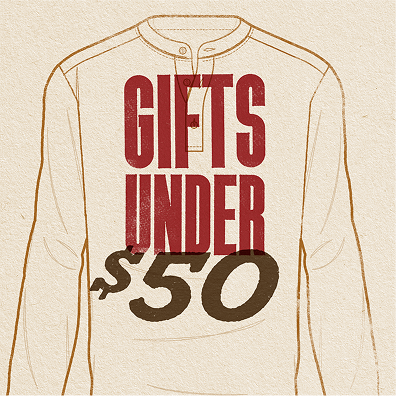
Shop By Price
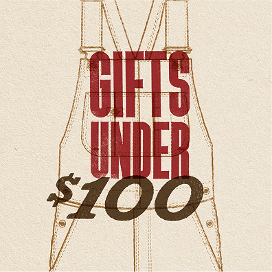
To represent the categories I used illustrations of the apparel that were taken from the product drawing vectors. I manipulated them with various brushes and edits, then applied effects that gave it the imperfections of print on paper the type used textures that my daughter and I created from ink and roller on cold and hot press papers. The effects here would also be applied throughout our campaigns and distributed to our global teams.
To help the global team, I created vector files of all of these with the effects applied on editable type. Included with these was a step by step procedure on applying the effects. We didn’t need total consistency as they were meant to be imperfect, but we did need the colors and applications to be the same across all of our channels globally.
Review the email prototypes above by clicking the image or link
The emails for these combined moments of product education, editorial write ups with Staff Picks and breaking down our assortment by price. To elevate the type, I applied the same effects the run throughout the campaign. A little animated drawing and wiggle helps, too.
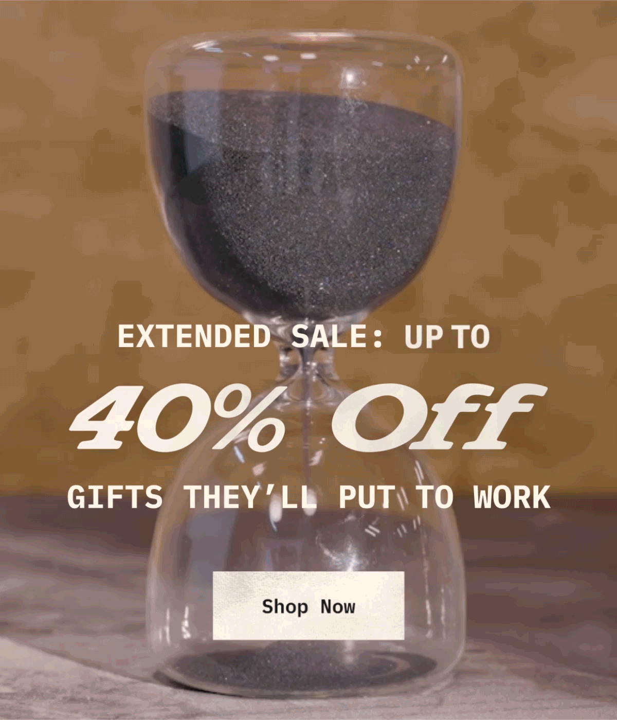
The team shot video of an hourglass for urgency messaging in our Cyber Monday Moment. I later adopted this into the holiday campaign shipping message.
The experiment for our e-comm, Paid Social and email channels.
The first of the messages in email
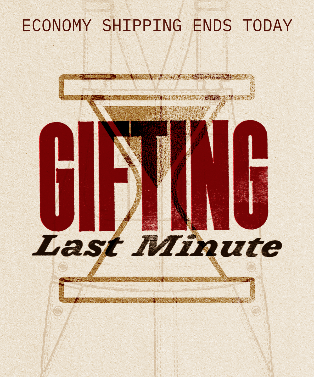
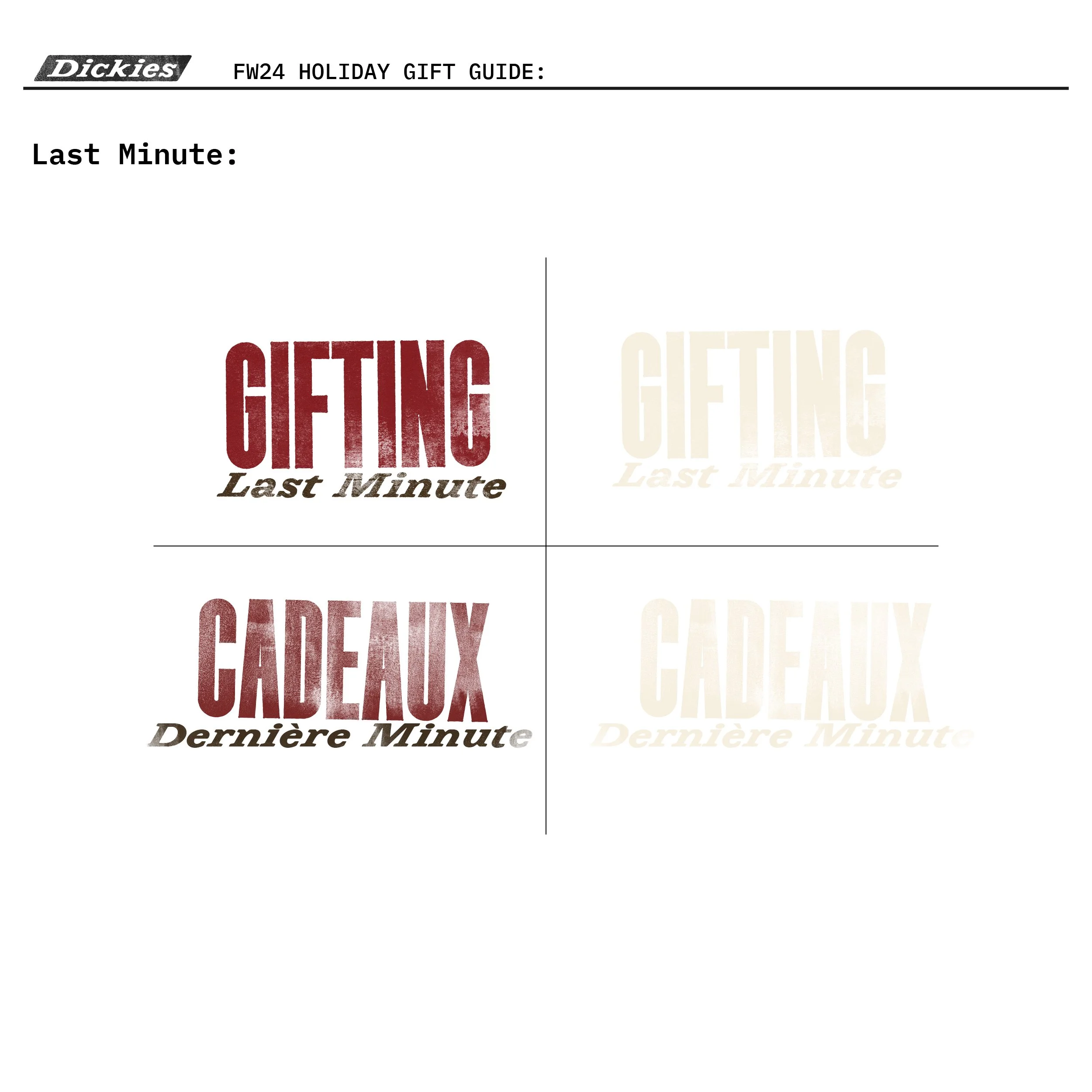
Last minute gift message

Added lighting to animation
User generated content was also used. This was also used as a test in our email channel to see what performed better.
Set of ads using the Primary Message
Icon messaging for Paid Social ads.
Desktop banner English version of the launch Hero
Desktop banner French version of the launch Hero
Emails Evolved
Our email team was open to trying new solves for pairing products. Often this was done in an assortment of SKUs, but we felt that we could elevate this in the same way that we were doing with our other campaigns. The paired apparel slayed in performance. This was later applied to our “business as usual” (BAU) emails.
This campaign was intended to be global. We needed to create a tool kit for any designer in the organization to pick up and carry out the work with a consistent look & feel. Everything from type, color, treatments, animations and file naming conventions needed to be there. There was more that what is shown in the slide below, but this is how I organized the art for any designer to use.
Key Art & Tools
Main message lockup on hero
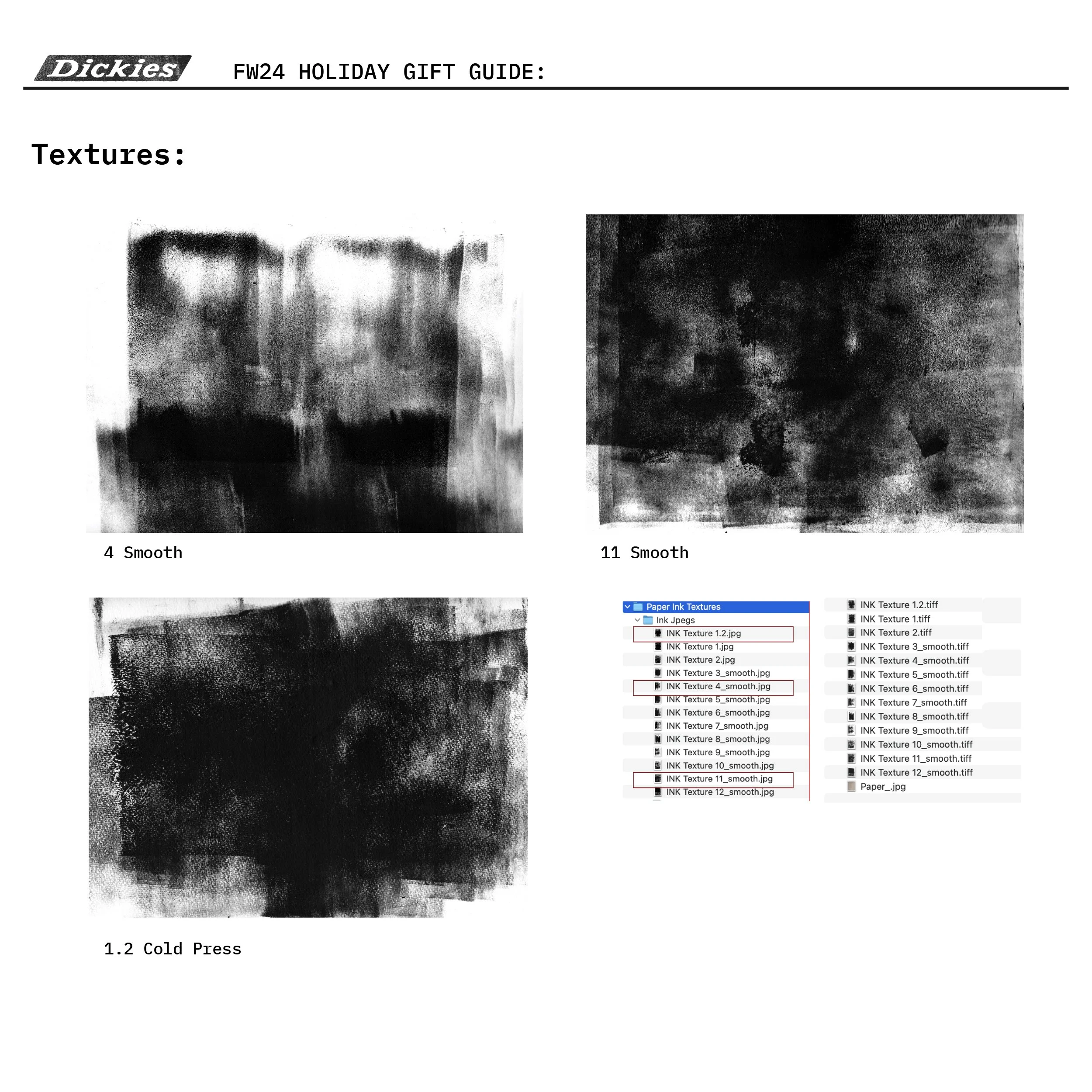
Ink & paper textures

Type effects
Lockup set

Typography
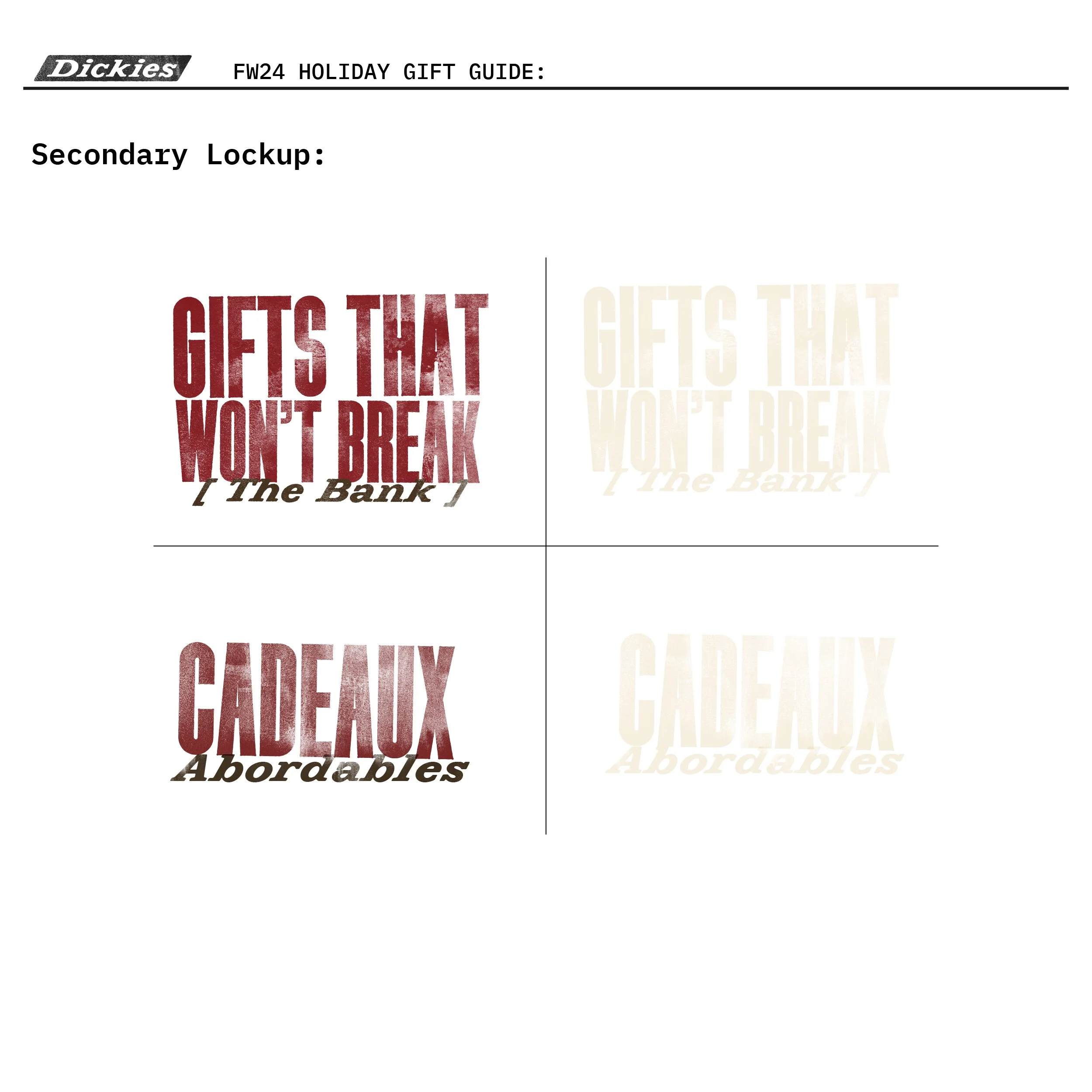
Secondary message lockup
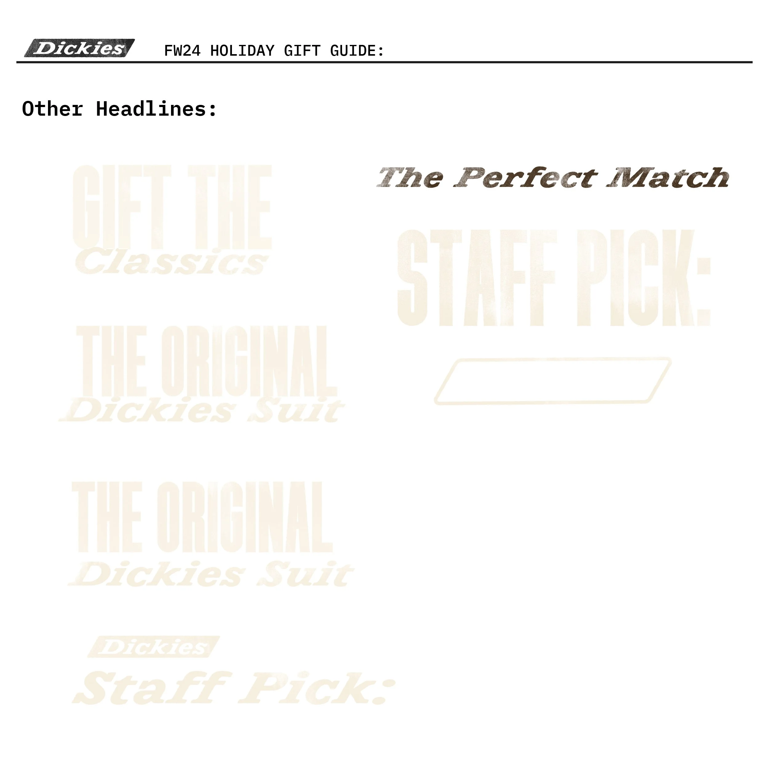
Headlines
Urgency message
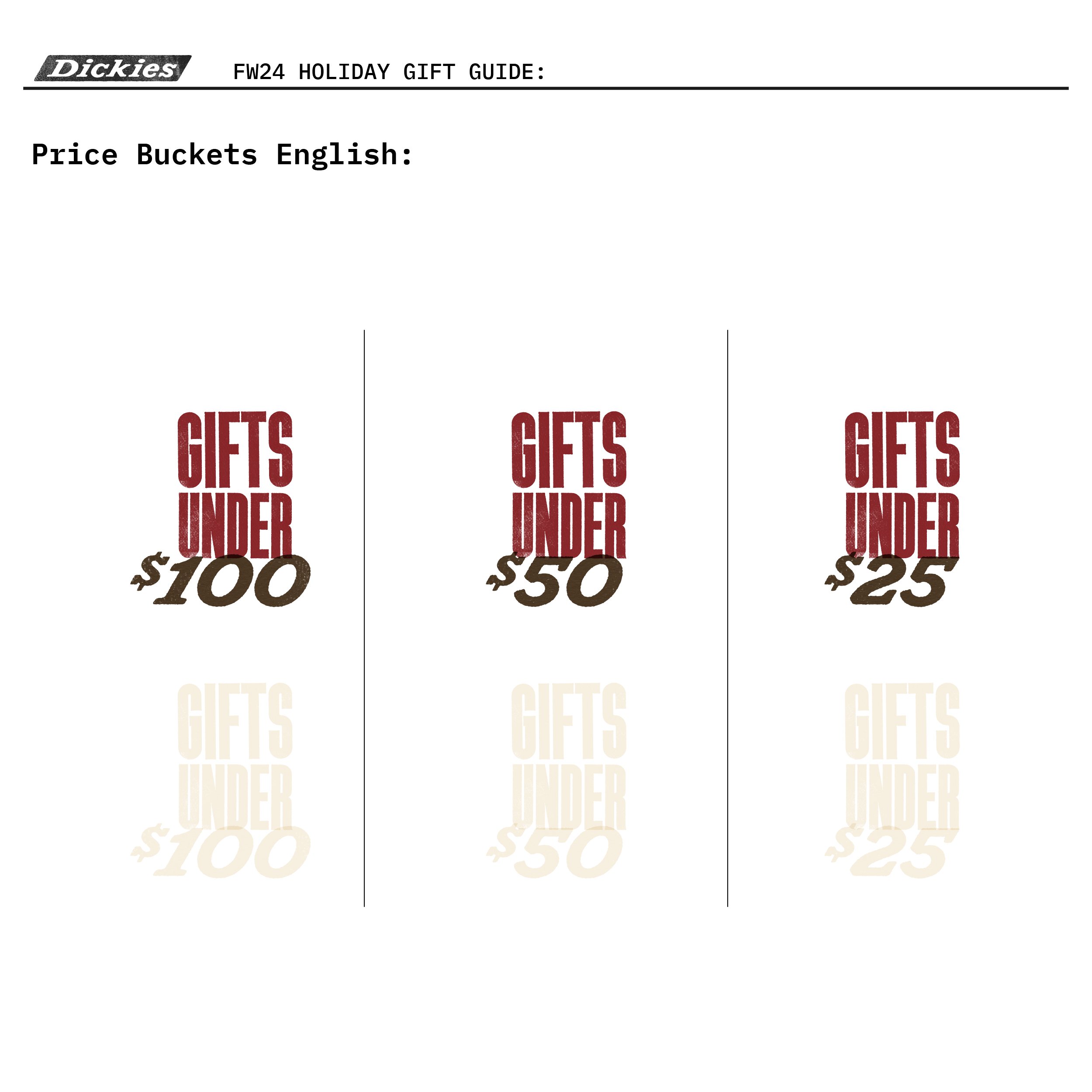
Price blocks
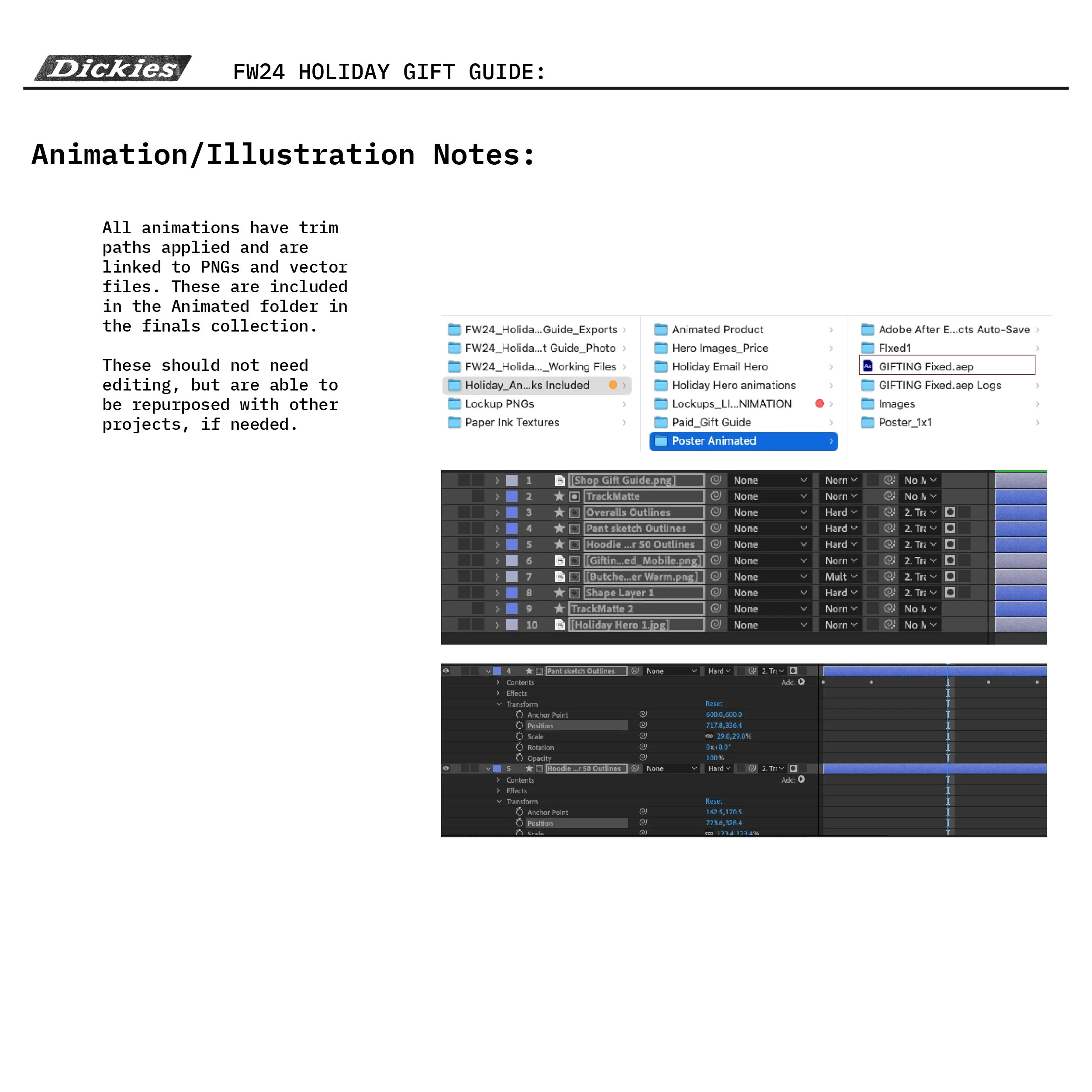
Animation notes
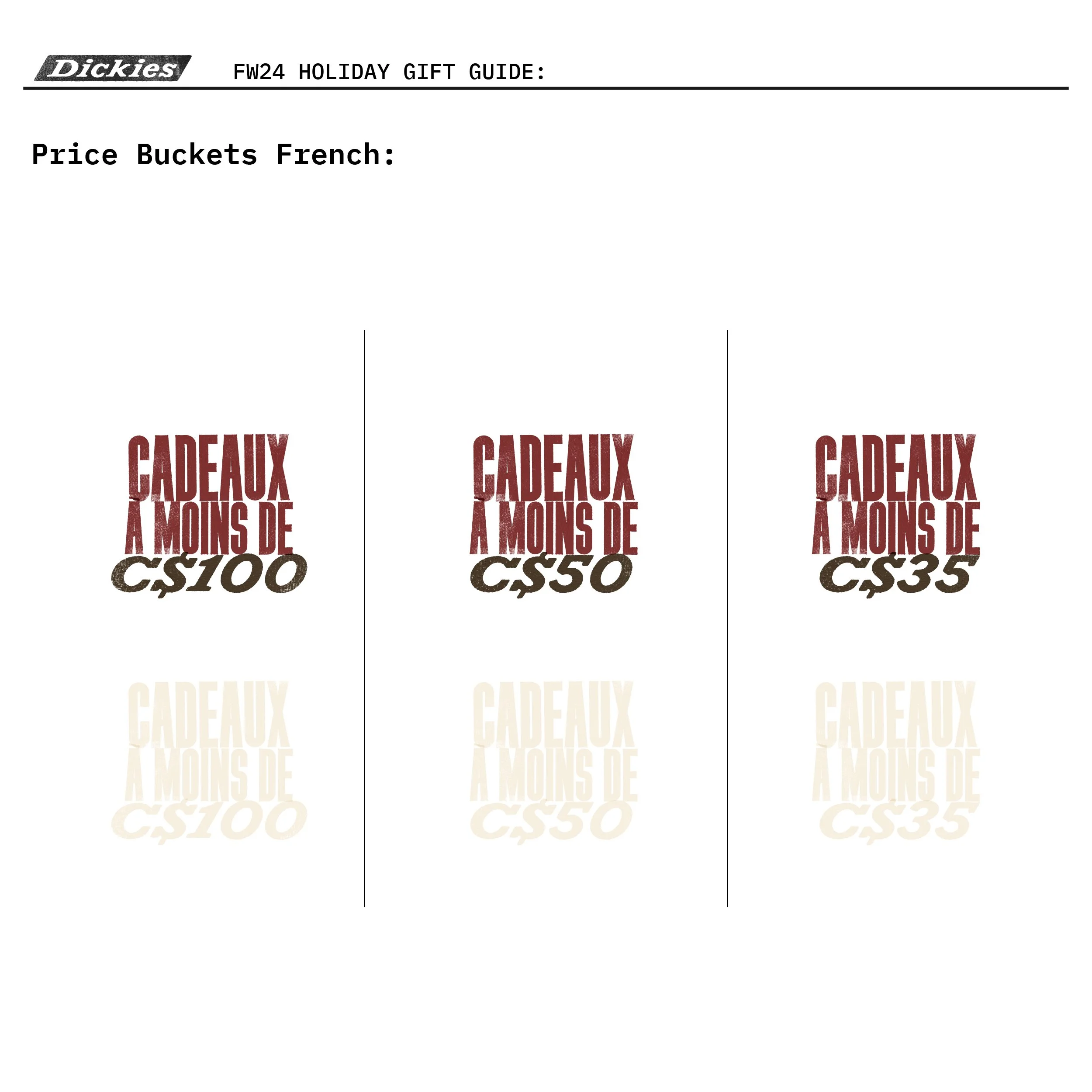
Price blocks French
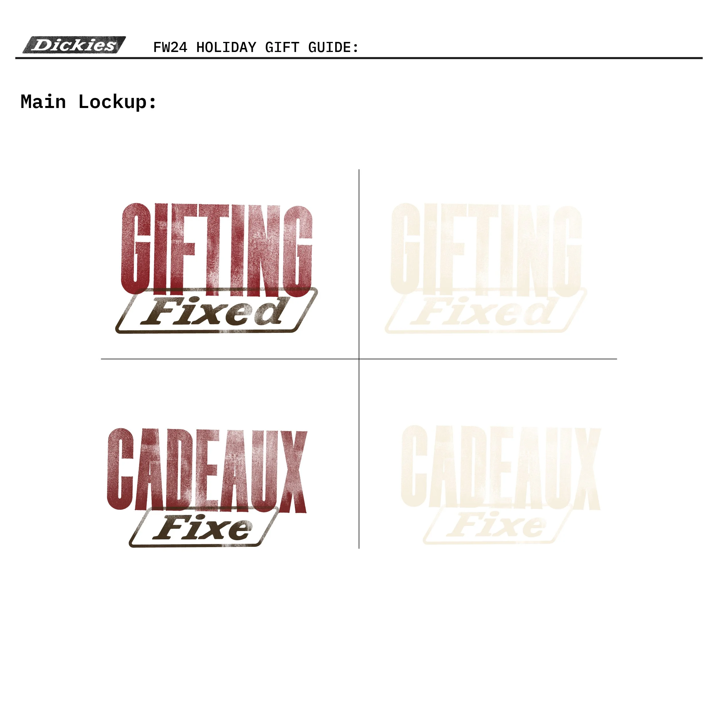
Main message lockup
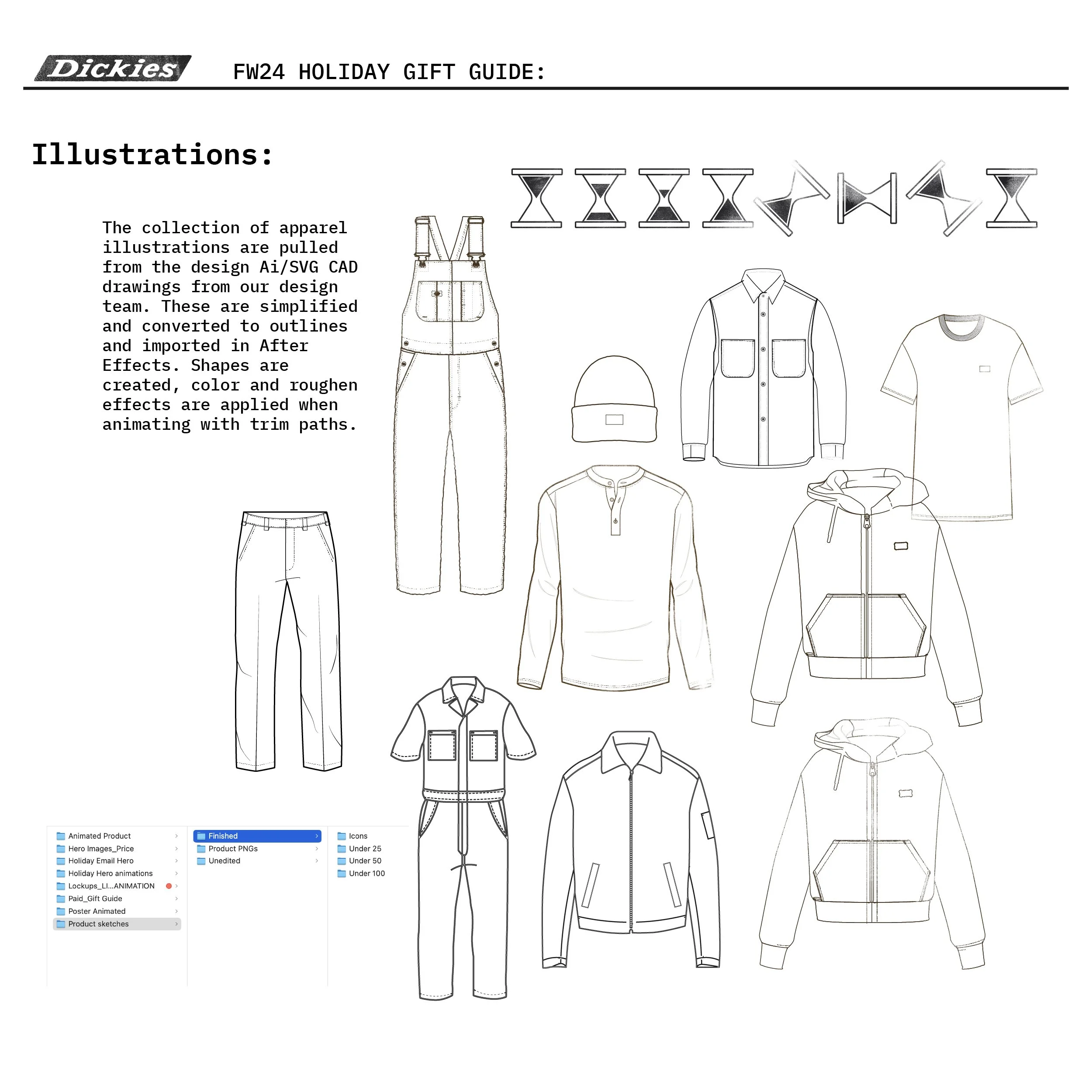
Illustrations
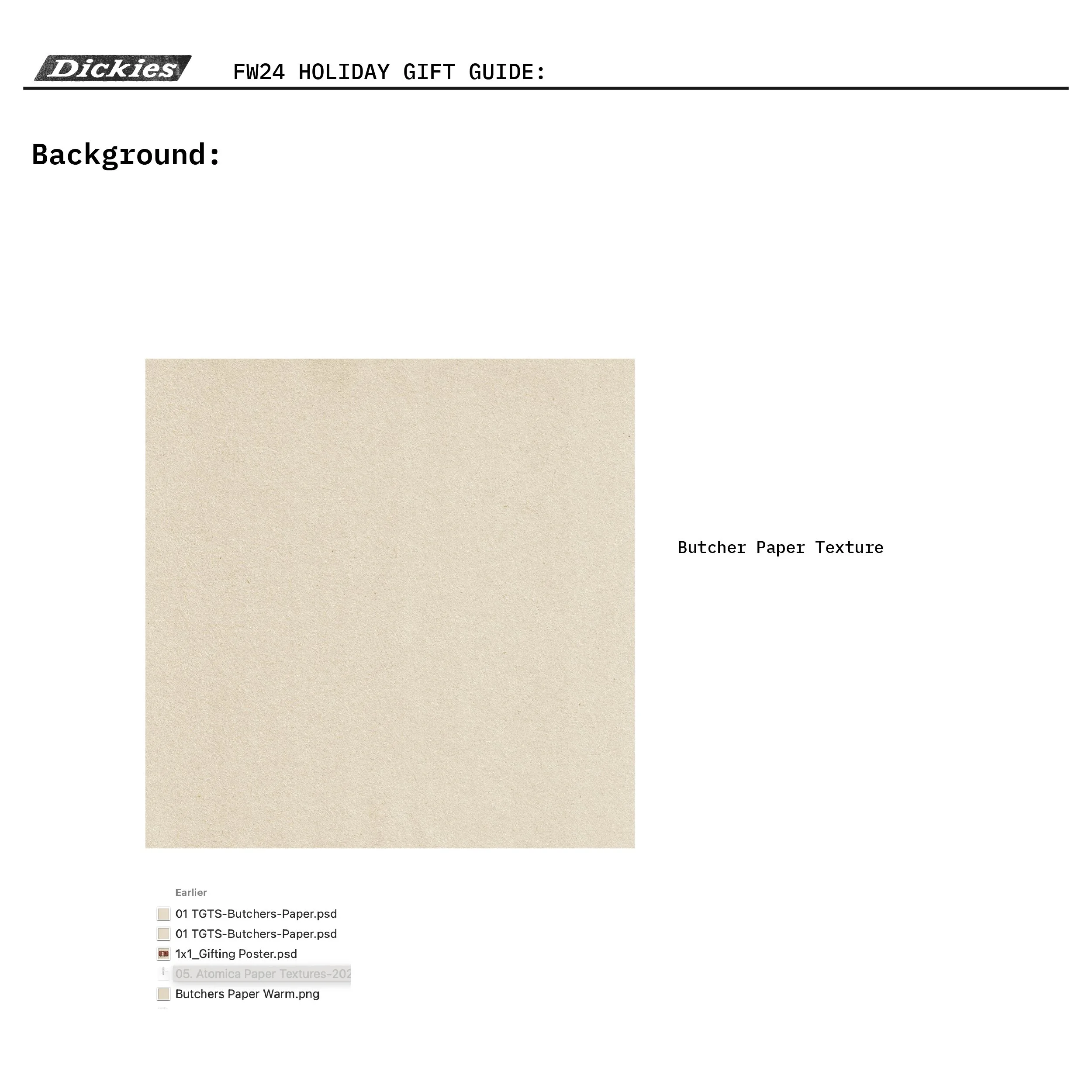
Background paper

Color
Another variation of the paid assets