Outdoor Layers
Key Art Design
Campaign Design
Digital Art Direction
Campaign Design
Video Resizing & Edits
Motion Graphics
Role
Creative Director: Erin Rountree
Senior Art Director: John Klopping
Photography: Zak Bush & John Klopping
Video: Ben Gulliver
Video Editing: Alex Craig
Copywriter: Alex Chavez
Production: Tyler Arrivillaga & Vincent Mauro
Stylist: Elizabeth Carvaloh
Talent: Lake Country Log Cabin Homes & Kalen Thorien
Crew
The Set Up
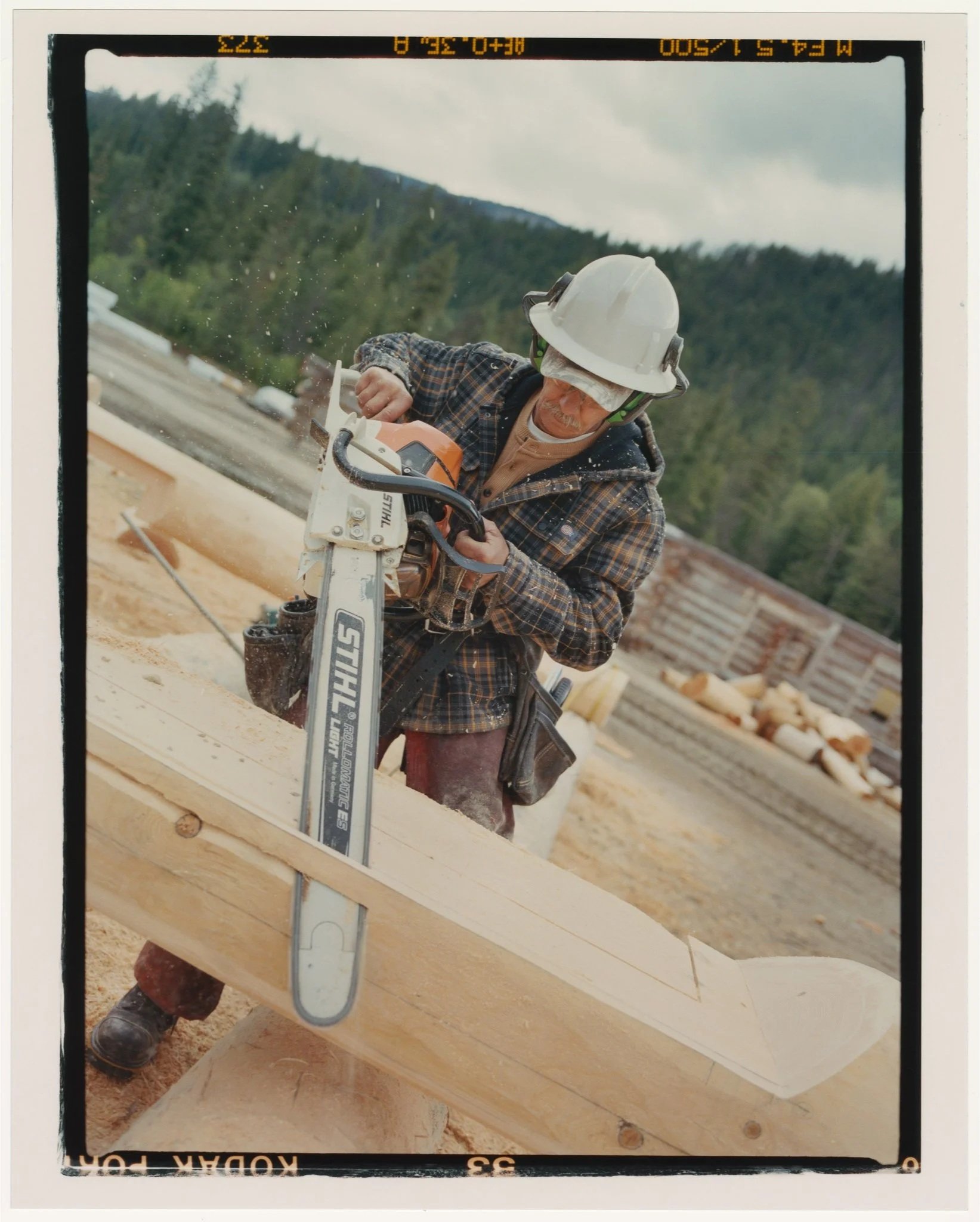
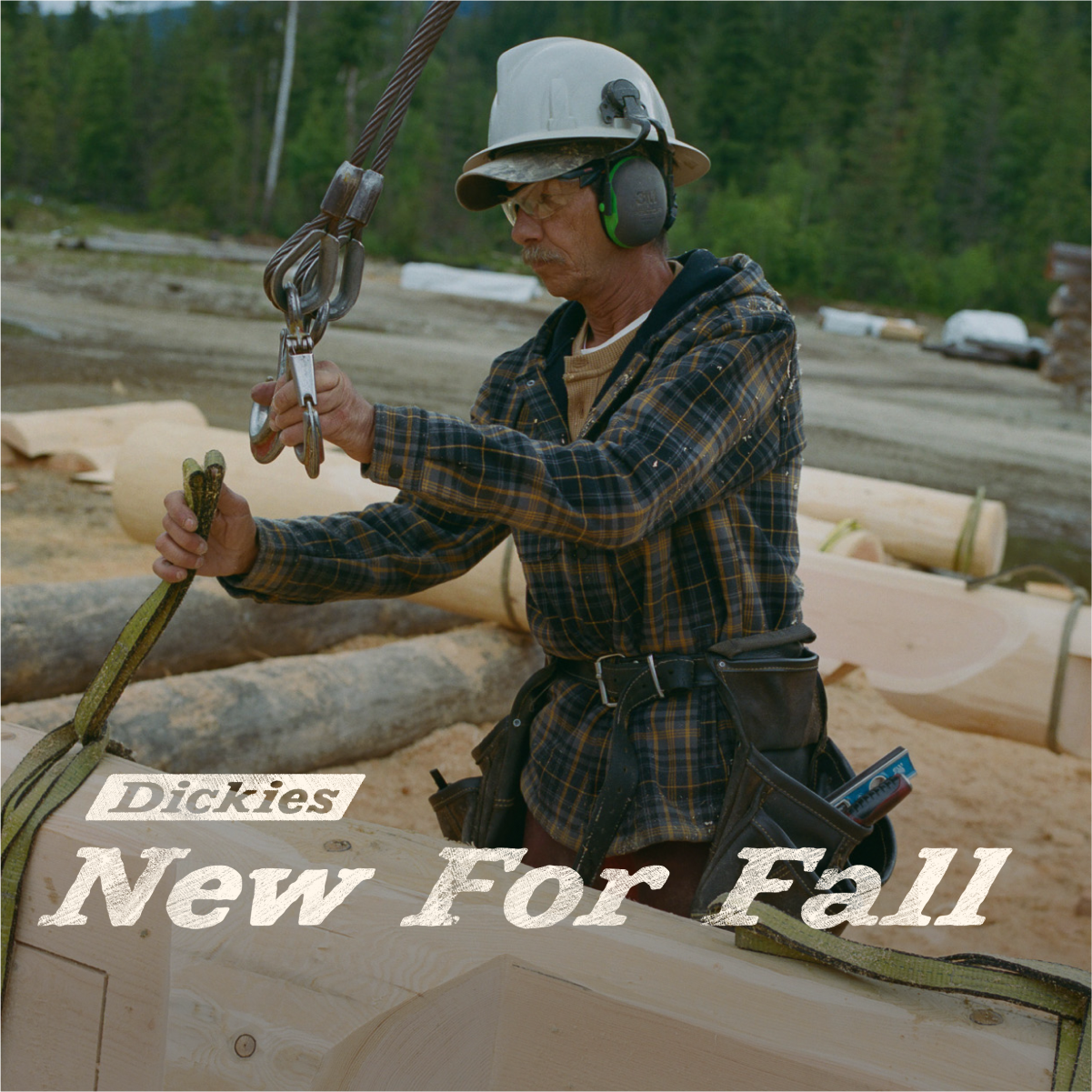
The creative team was in a state of flux when this one was going into production. Our production crew went to Canada to document the work of Lake Country Log Homes. The goal was to capture lived/real-work moments in Dickies outerwear apparel. This would feature our layering collection and a variety of pants.
We shot on/off body to accompany the needs of e-comm’s category cards. This would make for a cohesive look across channels and site. Ultimately we also built up our library of photography assets to supplement other campaign needs.
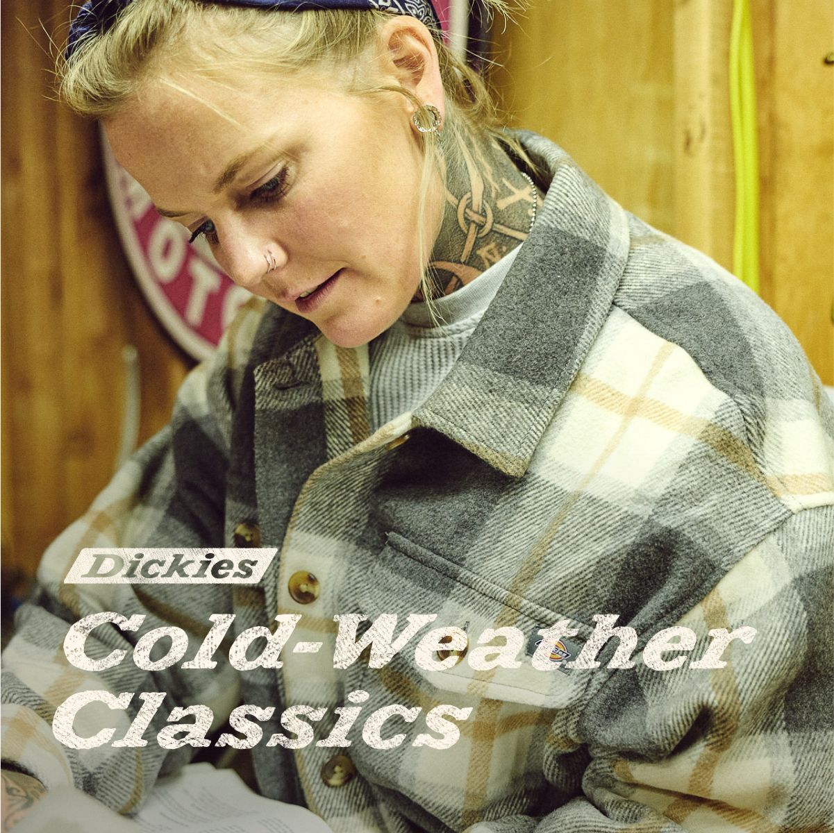
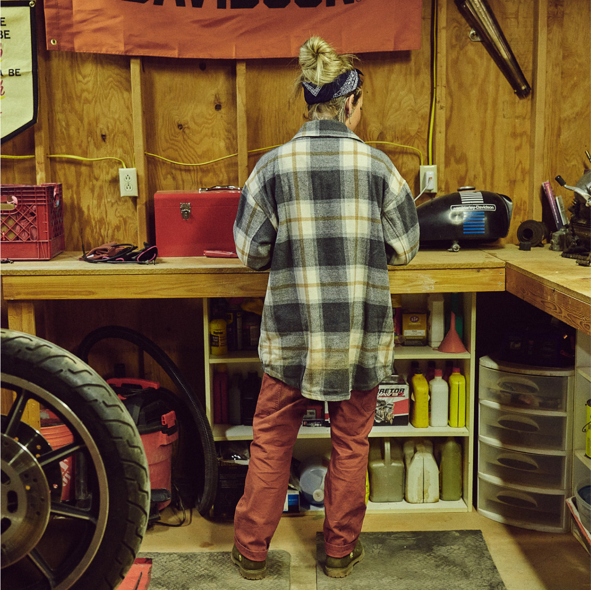
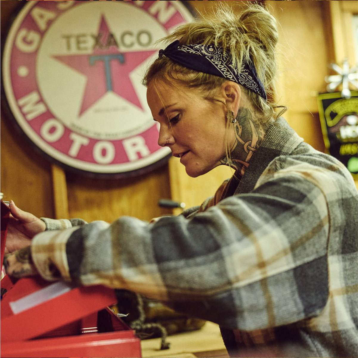
For the women’s part of the story, our ambassador Kalen Thorien joined us at her home in Utah to feature apparel in the garage, on the motorcycle and in the field.
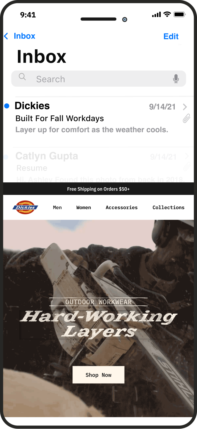
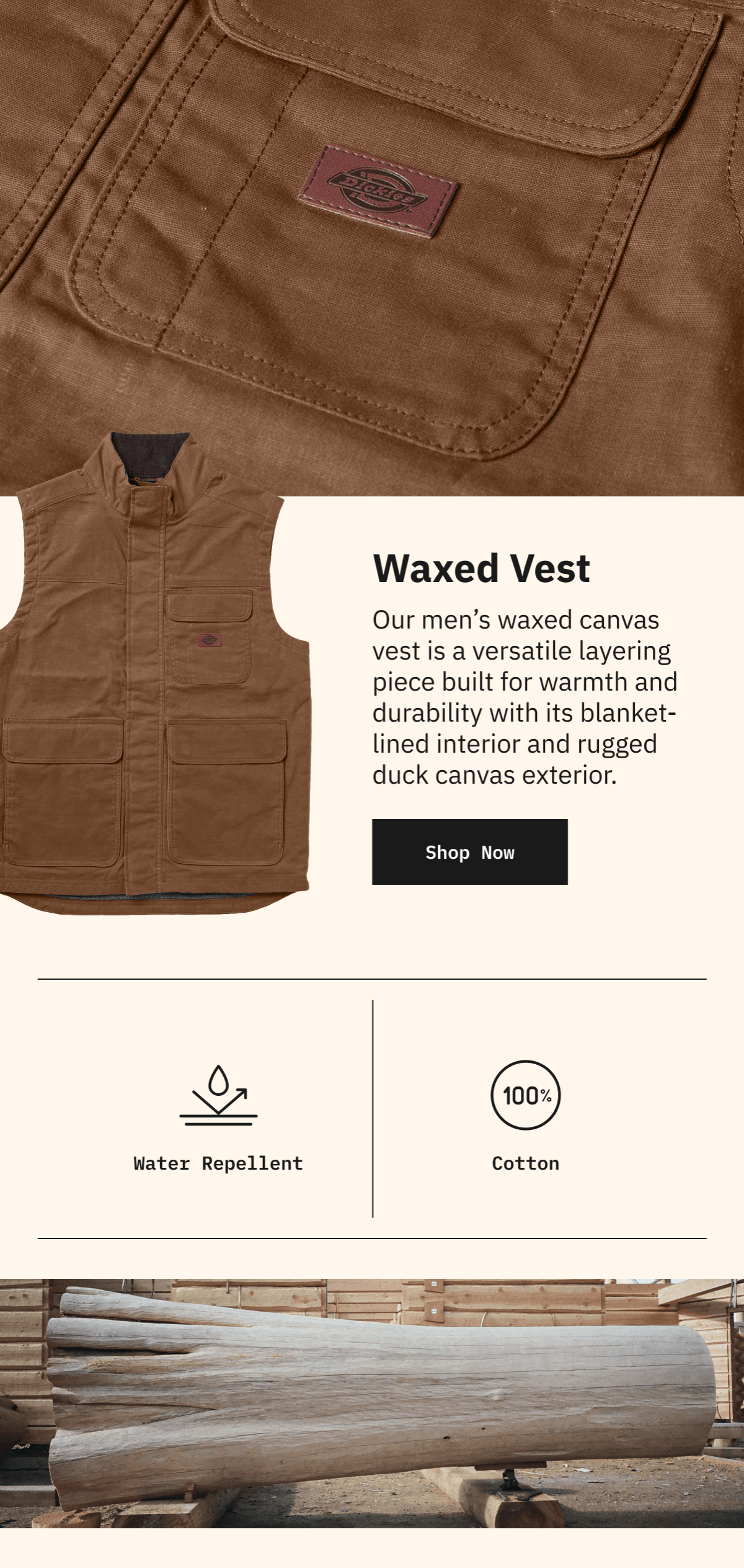
This also led to a massive improvement in email product education and product story telling. I designed a new set of templates that feature a space for story telling, product details and ratings. This was broken up in a way that was modular and transactional.
Launch Email Sample
Example here shows the update to our emails that we previously stripped down and more transactional. Our customers skewed more gen-X and older millennial, who were more likely to engage with an editorial email. We did some testing in previous emails that I designed similar to this and ultimately they performed better than emails that were bare of information.
I also extracted portions of the Hi8 video we captured on this shoot. Doing this gave an elevated feel to our emails that were often static. These also paired well with the textured type I created from our custom Big Text font. The texture was created from a photograph of a cut log. Rather than straight FFFFF white, I used our brand Light Khaki.
Sample prototype linked above.
Women’s Specific Carousel for Paid Social
One of many banners for Gear Junkie
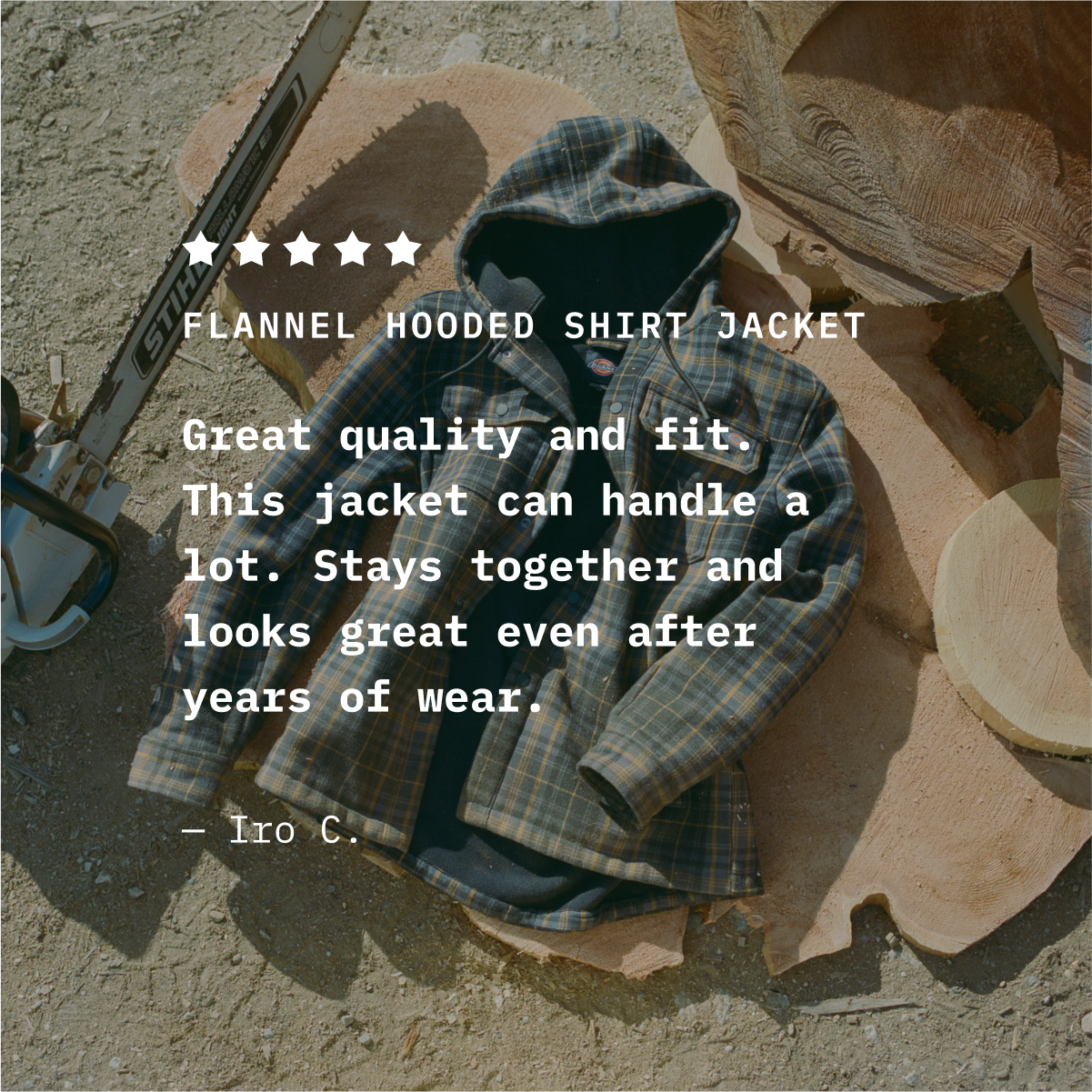
Using reviews in Paid Social proved successful
Desktop English version of the launch Hero
Desktop French version of the launch Hero for Canada
Graphic Application
To give this campaign it’s own moment, but not stray from brand recognition we chose to use minimal graphics, but went maximalist on our current brand font, Big Text. This would let the campaign stand out, use our mixed media aesthetic yet tie nicely with our day-to-day emails and social posts.
All of the headers, CTAs & eyebrows also had to be translated to French. I’m really fast doing this in Illustrator, so I built out an entire set from our copy in the creative tool kit we built for this and then made a translated version of each. These were exported as PNGs making it easy to apply to video.


Overall Story for Paid Social