Letter to Letraset
Sections from original prints from 2001 paste-ups
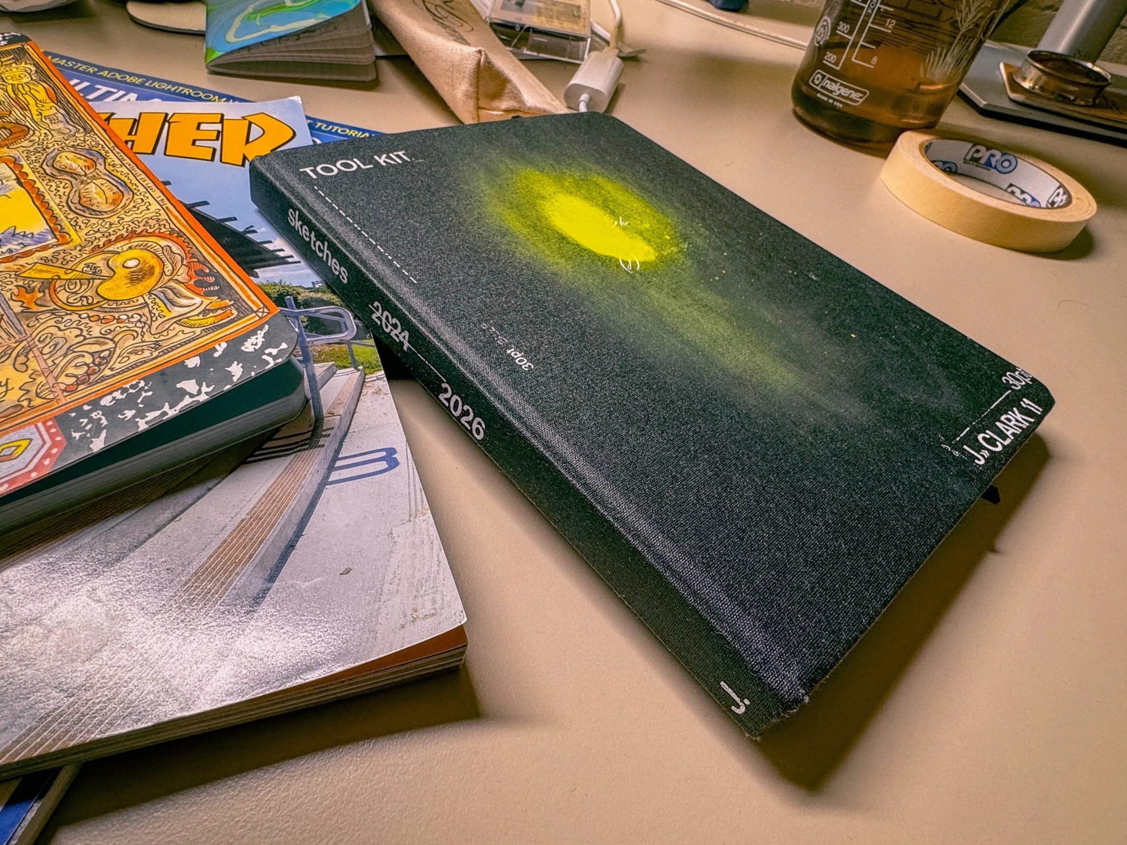
Do you ever have those times when you walk into a room to get something and you get distracted by something else? whether or not you have ADHD like me, you probably go through the same thing. I was supposed to be doing dishes, the big kids were bathing in blue light, my wife was getting to some homework after our littlest went to sleep, I picked up a blank sketchbook that I started last year—on this very week. I forgot about the dishes. A Sharpie came out and I started scribbling. There was a sudden urge to add more meaning to this book. I bought this the night we brought our middle child to see Carson Ellis speak about her latest book. It was inspiring, so I wanted to start a visual journal. It fell apart. The busy day-to-day and distracted by other things. Tonight, however, I was going to pick it up again and start playing. This made me open up my folio of Letraset.
It may have been mentioned in a previous post, but when I started this stuff, I did not have a computer. I was as scrappy as one could get to get some graphic design done. This may explain why I agree with the philosophy of Mossimo Vignelli, “If you can design one thing, you can design anything.” Granted, I often felt very behind on tech, even though I started using Photoshop in 1995 and used one of the first digital cameras sold to the market—not my jam. So, when it came to applying type to an image, I often had to go to Kinkos, school’s computer lab or went to a buddy’s who’s parent was footing the bill for school. I wasn’t so lucky.
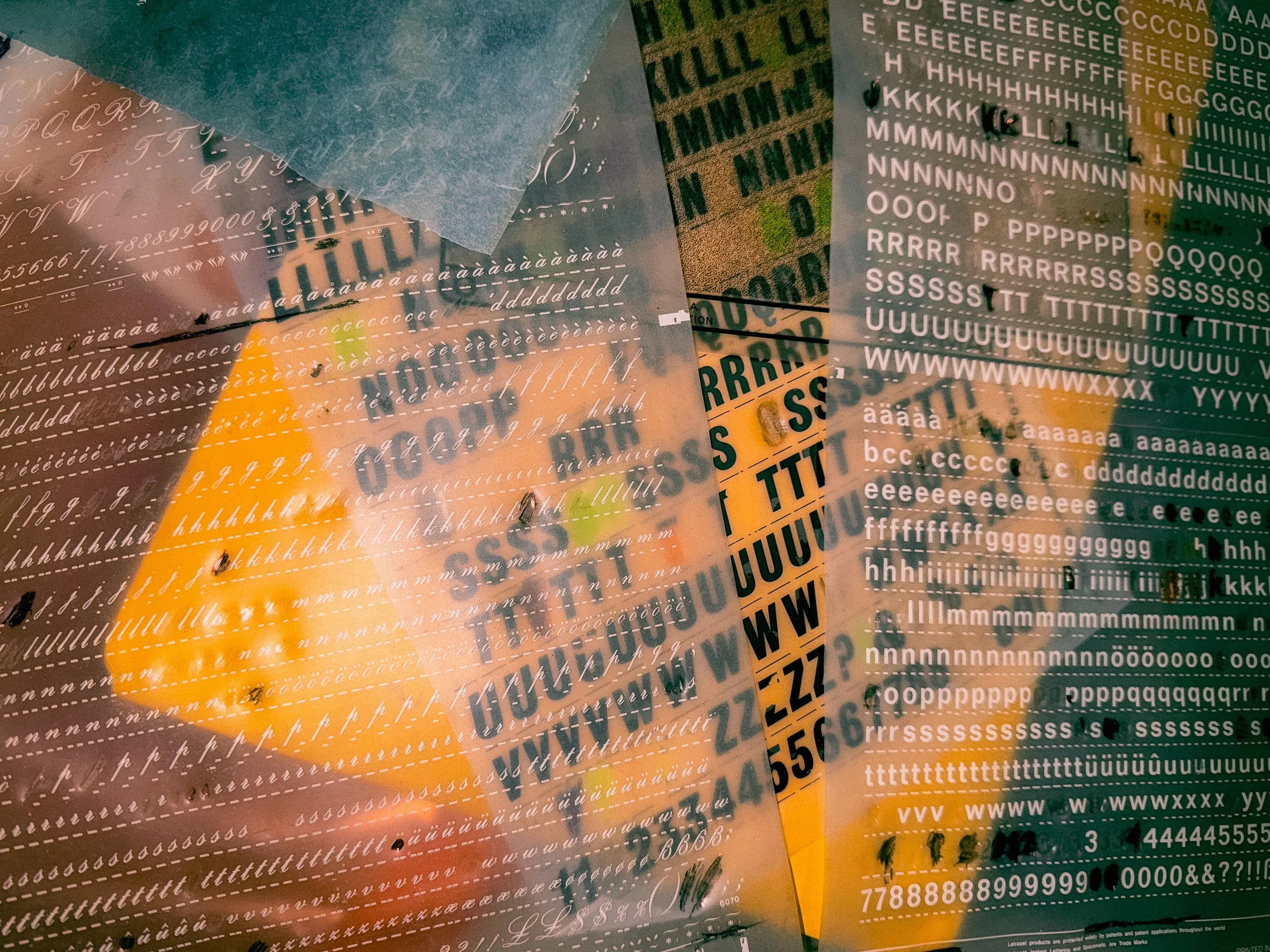
Though I could play all I wanted in Illustrator, Photoshop and even Quark, which was the standard back then, I never felt like it gave me the feeling I wanted. It was too mechanical. Letter press and screen printing were occasional options, but that took going to Minnesota Center for the Book Arts or making a huge mess. I didn’t do a lot of photo emulsion. Often I would cut Ulano and adhere stencils to a fine mesh. The quicker method was using Letraset Press Type.
Using this method, I could experiment with modern type that felt mechanical, but with human error attached. Sometimes there was a sense of urgency, play or experimentation. I had various textures and shapes as well, not just fonts. Though, my favorite of course was the Helvetica & Futura. I had a lot from the 70s–80s that gave up on working. The ones that stopped working were not Letraset Instant Type.
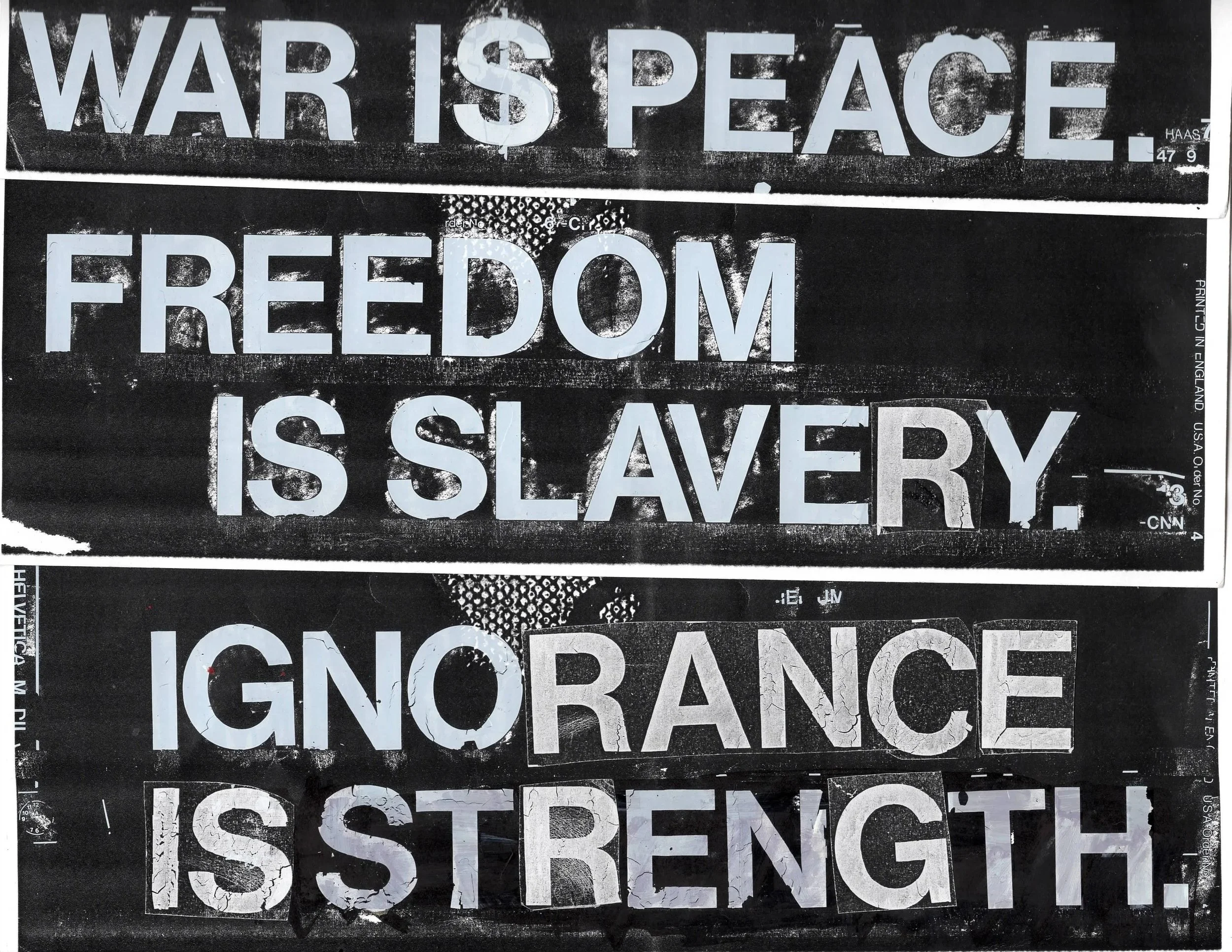
The years that I really got into using these, I did finally have my own iMac, good enough for making CDs and posters. Still, I loved playing with mixed media. It just felt more human (wow, we hear that more than ever now). These were the years of Bush, Cheney, 911, my first actual design job going away. I felt some angst. So, what does one do? They make posters. Press type made the cliché Orwell posters that I would paste up on old warehouses and bridge pillars. Friends actually snatched up most of them. I paid nearly nothing for them at the Kinko’s my buddy worked at.
Current pile in my basement
Still to this day, I play around with this. I’ve used Avant Garde Gothic to help me design a logo when I was stuck. I’ve applied it to sale lock-ups when the bosses weren’t looking—and got huge props for it. It’s one of those tools I keep around that not many designers think about. It’s saved me from boredom and sometimes a reason to just play with type.
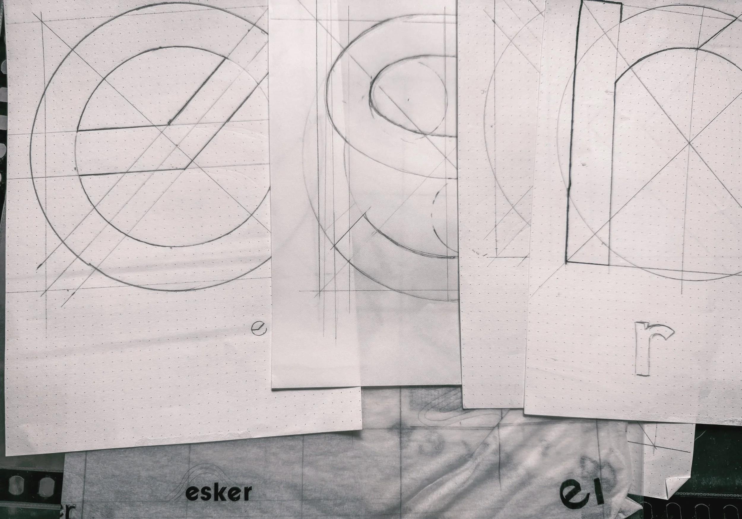
Original type design for Esker Cycles word mark, using press type for inspo/reference
At the very least, the sketch book looks a little better in the desk clutter. It’s time to try that visual journal of doodles again.